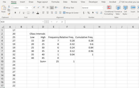
In the realm of data analysis, Excel stands as a stalwart tool, offering a plethora of functionalities to dissect and understand datasets. Among its arsenal is the frequency table, a powerful method for organizing and interpreting data distributions.
In this article, we delve into the essence of frequency tables in Excel, their role in data analysis, step-by-step instructions for crafting them, and the pros and cons of their utilization.
Understanding the Role of Frequency Tables
Before diving into the mechanics of creating frequency tables in Excel, it’s crucial to comprehend their significance in data analysis. A frequency table, essentially, provides a summary of the frequency of occurrences of values within a dataset.
It presents data in a structured manner, allowing analysts to discern patterns, identify outliers, and derive insights efficiently.
In Excel, frequency tables are instrumental in various analytical tasks, including market research, statistical analysis, and quality control. By condensing raw data into a concise format, they facilitate comparisons, trend identification, and decision-making processes.
Step-by-Step Guide to Crafting Frequency Tables in Excel
-
Prepare Your Data:
Before creating a frequency table, ensure your data is organized and formatted correctly. Each column should represent a distinct variable, and each row should correspond to a single observation.
-
Select Data Range:
Highlight the data range you want to analyze. This typically includes the column containing the variable of interest.
-
Access Data Analysis Toolpak:
If you haven’t already, enable the Data Analysis Toolpak in Excel. Navigate to the “Data” tab, click on “Data Analysis” in the Analysis group, and choose “Data Analysis Toolpak.”
This toolpak contains various statistical functions, including the one for generating frequency tables.

-
Choose Histogram:
After activating the Data Analysis Toolpak, locate and select “Histogram” from the list of available tools. Click “OK.”
-
Specify Input Range and Bin Range:
In the Histogram dialog box, specify the input range, which includes the data you’ve selected. Additionally, designate the bin range, which delineates the intervals for frequency calculation. You can either input this range manually or select the corresponding column in your dataset.
-
Decide Output Options:
Determine where you want the frequency table to appear. Choose whether you want the table to be displayed in a new worksheet or a specific location within the existing worksheet.
-
Review and Confirm:
Double-check your selections and configurations in the Histogram dialog box. Once satisfied, click “OK” to generate the frequency table.
-
Interpret Results:
Once Excel generates the frequency table, review the output carefully. It typically consists of two columns: one representing the bin intervals and the other displaying the corresponding frequencies.

Pros and Cons of Utilizing Frequency Tables in Excel
Pros:
-
Simplicity:
Excel’s user-friendly interface makes it easy for individuals with varying levels of expertise to create frequency tables effortlessly.
-
Visual Representation:
Frequency tables can be complemented with charts or graphs in Excel, enhancing data visualization and comprehension.
-
Flexibility:
Excel offers a range of customization options, allowing users to tailor frequency tables to their specific requirements, such as adjusting bin sizes or formatting output.
Cons:
-
Limited Statistical Functions:
: While Excel is adept at basic statistical analysis, it may lack the robustness required for advanced analytical techniques compared to specialized statistical software.
-
Potential Errors:
Human error or inadvertent misconfigurations during the creation of frequency tables in Excel can lead to inaccuracies, necessitating careful validation of results.

Things to Consider
-
Data Accuracy:
Ensure the accuracy and integrity of your dataset before constructing frequency tables to avoid misleading conclusions.
-
Bin Size Selection:
Exercise prudence when selecting bin sizes in frequency tables, as inappropriate choices can obscure underlying patterns or exaggerate trends.
-
Validation:
Validate the results obtained from frequency tables by cross-referencing them with alternative analytical methods or external sources to mitigate the risk of analytical biases.
Bottom Line:
In conclusion, frequency tables in Excel serve as indispensable tools for data analysts seeking to distill complex datasets into actionable insights. By following the step-by-step guide outlined above and considering the pros, cons, and pertinent factors, users can harness the power of frequency tables to unravel the mysteries hidden within their data.
