Visualizing data chronologically is a crucial yet often challenging task for many spreadsheet users. Excel offers a robust timeline feature that empowers you to illustrate trends, milestones, and metrics over any date range with ease. In this comprehensive guide, we will walk through the steps to create a fully functional timeline in Excel that filters your data dynamically.
Follow along to learn how to convert your dataset into a table and pivot table, insert a timeline slicer, and leverage Excel’s built-in timeline tools to their full potential. Whether you want to track progress across quarters, compare yearly sales, or visualize project timelines, building a timeline in Excel makes temporal data analysis intuitive.
With the ability to insert interactive timelines into your spreadsheets, you’ll be able to derive insights, identify patterns, and make data-driven decisions with confidence.
Step 1: Converting Data into a Table Object
The first step in creating a timeline in Excel is to convert your data set into a table object. Here’s how you can do it:
- Click inside your data set.
- Navigate to the “Insert” tab in Excel.
- Select “Table.”
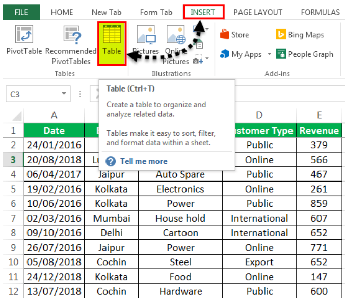
A “Create Table” popup will appear, displaying the data range and a checkbox for table headers. Click “OK” to create the table object.
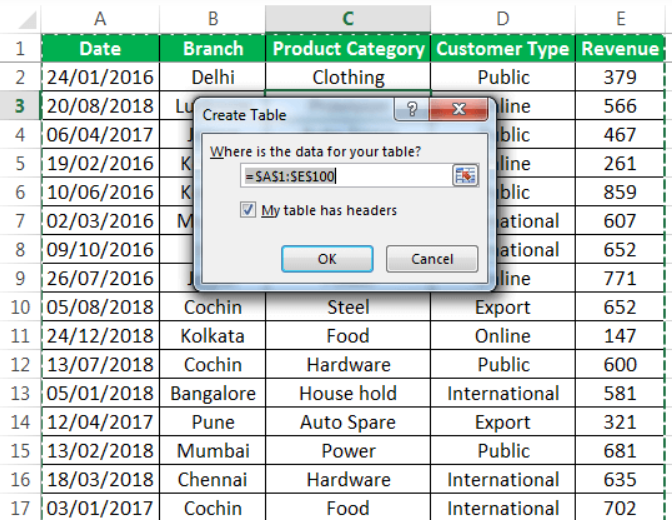
Your data will now be presented in a structured, tabulated form.

Step 2: Creating a Pivot Table
To effectively summarize revenue data across different categories within the timeline, we need to create a pivot table. Follow these steps:
- Click on the data set within the table.
- Go to the “Insert” tab.
- Select “PivotTable” and click “OK.”

A “PivotTable Fields” pane will appear on another sheet. Name this sheet as “PivotTable_Timeline.” In the “PivotTable Fields” pane, drag “branch” to the “rows” section, “product category” to the “columns” section, and “revenue” to the “values” section.

Step 3: Creating a Pivot Chart
Now, let’s base a pivot chart on the pivot table we’ve just created. Here are the steps to follow:
- Copy the previous sheet as “PivotChart_Timeline” or create a new sheet with this name.
- Click inside the pivot table on the “PivotChart_Timeline” sheet.
- In the “Home” tab, go to “Analyze” and select “PivotChart.”

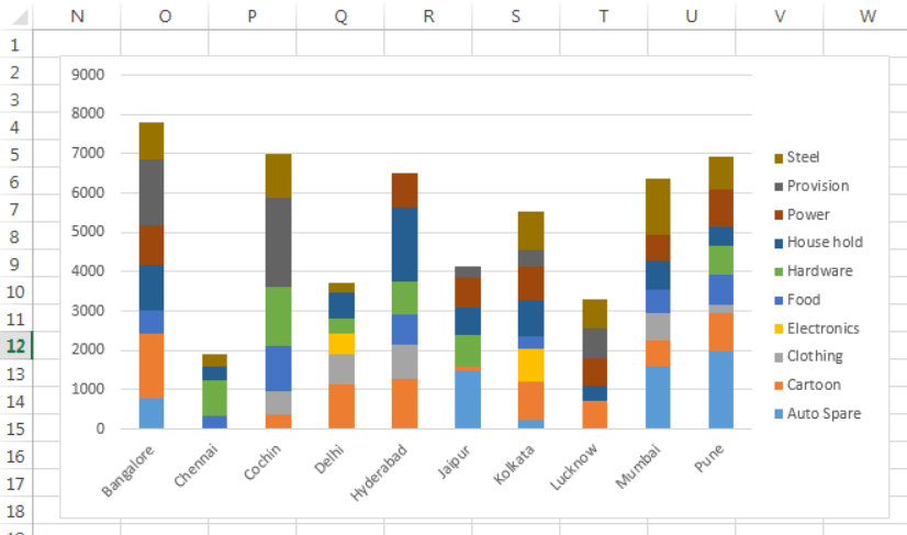
An “Insert Chart” popup window will appear. Choose “stacked column chart” and click “OK.”

The pivot chart will be generated, allowing you to visualize your data effectively.

In the pivot chart, you can hide unnecessary elements such as “product category,” “branch,” and “sum of revenue” by right-clicking and selecting “hide legend field buttons on chart.”

Now, your pivot chart will be shown as below:
Step 4: Inserting a Timeline in Excel
To add a timeline to your Excel sheet, follow these steps:
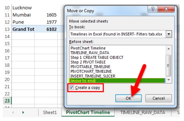
- Copy the “PivotChart_Timeline” to other sheets using the “create a copy” option.
- Right-click on the sheet named “PivotChart_Timeline” and rename it to “Insert_Timeline.”
- Click anywhere on the data set of the pivot table.
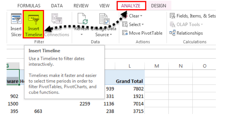
- Select the “Analyze” tab on the Excel ribbon.
- Click on the “Insert Timeline” button in the “Filter” group.
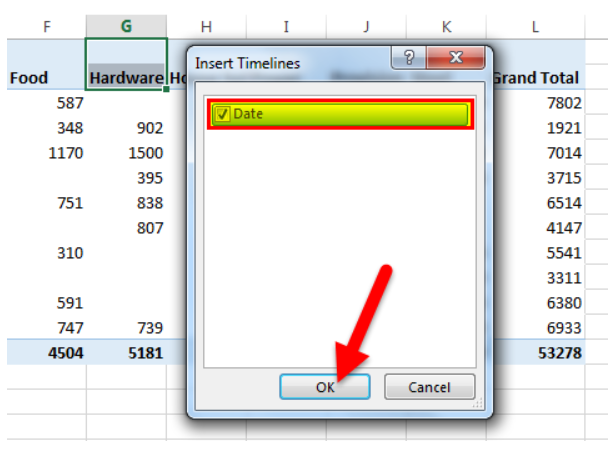
A “Insert Timelines” pop-up window will appear, displaying a checkbox with the date field. This serves as the filter for the timeline. Select the checkbox and click “OK.”
Your timeline is now inserted.
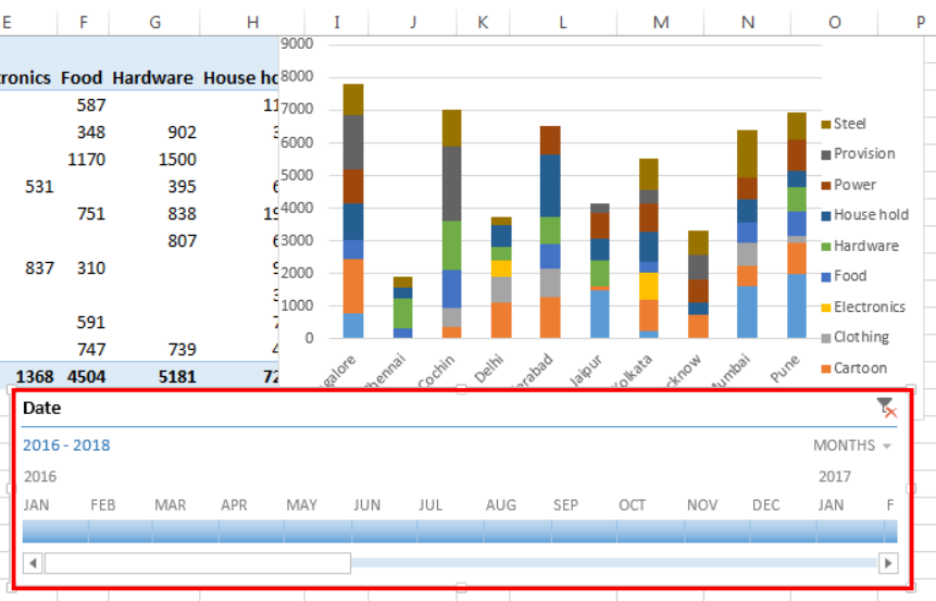
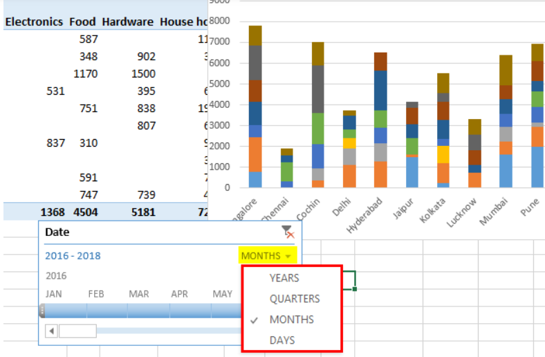
You can configure it to group dates by years, quarters, months, or days using the drop-down list.
How Does the Timeline Filter the Pivot Table?
Let’s take a closer look at how the timeline filters the pivot table:
- Click on a specific year in the timeline slicer to filter the pivot table for that year. You will see the revenue data for that year, broken down by branch and product category.
- You can also select “quarters” from the dropdown list. If quarterly data is not visible, drag the blue-colored box to reveal it. Choose a specific quarter to observe revenue across different branches and product categories.
The Bottom Line
With this step-by-step guide, you are now equipped to create impressive timelines in Excel that deliver insightful data visualization. By converting your dataset into a table and pivot table, adding a timeline slicer, and utilizing Excel’s robust timeline features, you can build dynamic timelines tailored to your analysis needs.
Whether you want to track KPIs over time, illustrate historical trends, or add temporal context to reports, the ability to insert timelines unlocks new possibilities. Implement these tips to make time-oriented data exploration effortless. You’ll be able to spot trends, anomalies, and opportunities in your data through intuitive timeline charts.