In the world of data analysis and visualization, Microsoft Excel plays a pivotal role. Excel charts provide a powerful way to present data visually, allowing users to understand trends and patterns with ease.
However, there may be instances where you need to switch the orientation of your data, transforming rows into columns and vice versa. In this article, we will explore various methods to switch rows and columns in an Excel chart, offering step-by-step guidance and useful tips to make your data manipulation tasks more efficient.
Understanding Rows and Columns in Excel Charts
Before we delve into the process of switching rows and columns in Excel charts, let’s first understand the concept of rows and columns. In Excel, rows are horizontal divisions, and columns are vertical divisions that intersect to form cells.
Rows typically represent different data points, while columns define various attributes or categories. Excel charts use this tabular data to create visual representations such as bar graphs, line charts, pie charts, and more.
Why Switch Rows and Columns in Excel Charts?
There are several scenarios where switching rows and columns in an Excel chart becomes necessary. For example, if you have data in a vertical column format and want to present it horizontally for better visualization, you would need to switch rows and columns.
Additionally, when working with large datasets, switching rows and columns can help reorganize the data and provide a different perspective, enabling easier analysis and identification of trends.
Manual Method: Transposing Data in Excel
One way to switch rows and columns in Excel is by using the manual method known as “transposing.” This method allows you to reposition data from rows to columns or vice versa. To transpose data, follow these steps:
- Select the data range you want to transpose.
- Right-click on the selection and choose “Copy” or press Ctrl+C.
- Choose a new location where you want to paste the transposed data.
- Right-click on the new location and select “Paste Special.”
- In the Paste Special dialog box, check the “Transpose” option.
- Click “OK” to complete the transposition.
Switching Rows and Columns in Excel Charts
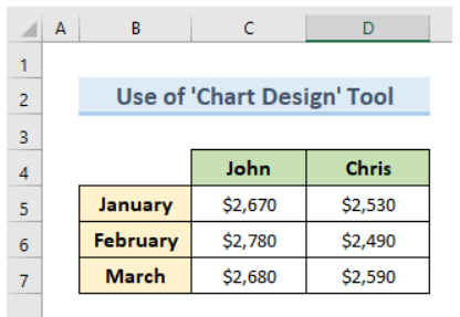
Now that you understand how to switch rows and columns in Excel using the manual method, let’s focus on applying this knowledge to Excel charts. In order to switch the rows and columns in an Excel chart, we can utilize the powerful ‘Chart Design’ tool. By following this method, we will demonstrate how to accomplish this task using a sample dataset.
To gain a better understanding of the process, let’s create a chart based on the provided dataset and then proceed with switching the rows and columns.

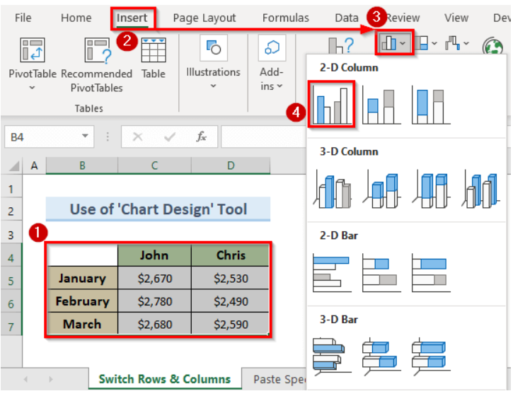
- To begin, select the cells containing the data you want to visualize (B4:D7).
- Next, navigate to the ‘Insert’ tab located in the Excel toolbar.
- Within the ‘Insert’ tab, you will find the ‘Insert Column or Bar Chart’ drop-down menu. Click on it.
- From the drop-down menu, choose the ‘Bar Chart’ option that corresponds to your dataset. This will generate a chart displaying the selected data.

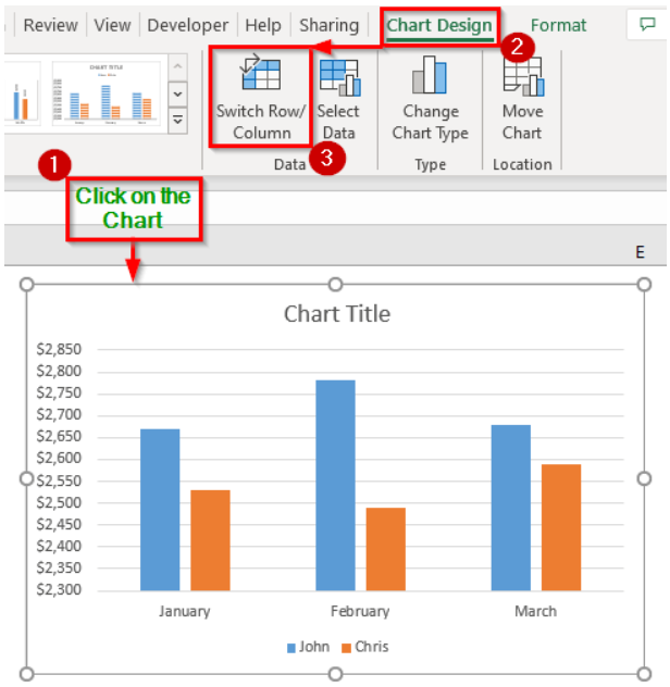
- Now, direct your attention to the newly appeared tab named ‘Chart Design’ upon clicking on the chart.
- Within the ‘Chart Design’ tab, locate the ‘Switch Row/Column’ option and click on it.

- Upon completing the above steps, you will observe that the chart has been updated accordingly. The rows and columns have been interchanged, as illustrated in the image below.

Tips for Formatting Excel Charts
When working with Excel charts, it’s essential to format them appropriately to enhance their visual appeal and readability. Here are some useful tips for formatting your Excel charts:
- Choose the right chart type that best represents your data.
- Adjust the axis labels, titles, and legends for clarity.
- Apply consistent colors and fonts throughout the chart.
- Add data labels or annotations to provide additional context.
- Use gridlines or trendlines to highlight patterns.
- Customize the chart’s size and position to fit your needs.
- Experiment with different chart styles and themes.
Common Challenges and Troubleshooting
While switching rows and columns in Excel charts is a relatively straightforward process, you may encounter some challenges or errors along the way. Here are a few common issues and their possible solutions:
Mismatched data ranges: Ensure the data ranges in the chart and the source data match correctly.
Incorrect data orientation: Double-check that the data in the source range is organized correctly before switching rows and columns.
Hidden data: If certain data is not visible in the chart after switching rows and columns, verify if any hidden rows or columns are affecting the visibility.
Advanced Techniques for Data Manipulation in Excel
Switching rows and columns is just one aspect of data manipulation in Excel. To become proficient in Excel and leverage its full potential, you can explore advanced techniques such as:
- Using formulas and functions to manipulate data dynamically.
- Applying filters and sorting data based on specific criteria.
- Using pivot tables for in-depth analysis and summarization.
- Creating macros to automate repetitive tasks.
- Incorporating data validation and conditional formatting.
Conclusion
Switching rows and columns in an Excel chart is a valuable skill that allows you to transform data orientation and gain new insights from your visualizations.
Whether you choose to use the manual method or the Paste Special feature, the ability to manipulate data efficiently is essential for effective data analysis. Remember to format your charts appropriately and explore advanced techniques to further enhance your Excel skills.

