Excel is a powerful tool for data visualization, and pie charts are one of the most commonly used chart types to display proportions and percentages in an intuitive and visually appealing manner.
While creating a pie chart in Excel is relatively straightforward, adjusting its appearance and ensuring that it effectively communicates your data can be a bit challenging, especially when it comes to rotating the chart to achieve the desired angle.
Whether you’re a seasoned Excel user looking to enhance your data presentation skills or a beginner just starting to explore the world of charts and graphs, this step-by-step guide will take you through a seamless process to effortlessly rotate your pie chart in Excel to present your data in the most impactful way possible.
Get ready to unravel the secrets of Excel chart manipulation and take your data visualization game to the next level!
Understanding Pie Charts in Excel
Before we delve into the process of rotating pie charts, let’s take a moment to understand what they are and why they are widely used in data visualization. Pie charts are circular graphs that display data in slices, with each slice representing a proportion or percentage of the whole. The total of all the slices equals 100%, making it easier to visualize the distribution of data at a glance.
Excel provides a simple and user-friendly way to create pie charts based on your data, and once you have created a pie chart, you might find the need to rotate it for various reasons. Whether it’s for better data clarity, emphasizing a particular data point, or enhancing the overall aesthetics, rotating a pie chart can make a significant difference in how you convey information.
Step 1: Accessing the Format Data Series Panel
To begin the process of rotating pie charts in Excel, follow these simple steps:
- Double-click the Pie Chart: Locate the pie chart you wish to rotate and double-click on it. This action will enable the “Format Data Series” panel, positioned to the right of your Excel spreadsheet. Alternatively, you can right-click on the pie chart and select “Format Data Series” from the menu that appears.
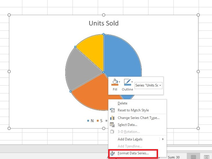
Once you’ve completed this step, the “Format Data Series” panel will appear on the right-hand side of the page, providing you with further customization options.
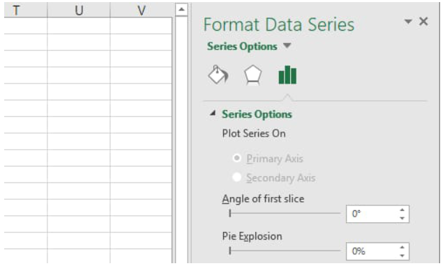
Step 2: Rotating the Pie Chart
Now that you have accessed the “Format Data Series” panel, proceed with the following steps to rotate your pie chart:
- Switch to Series Options: In the “Format Data Series” panel, look for the icon resembling a histogram, which represents “Series Options.” Click on this icon to access the relevant settings.
- Adjust the Angle of the First Slice: Within the “Series Options” section, you will find an option to modify the angle of the first slice. By changing the value in the provided textbox, you can effortlessly rotate the pie chart according to your preference. Experiment with different values to find the optimal angle that best presents your data.

By following these straightforward steps, you can rotate your pie charts and enhance their visual appeal, making your data more accessible and engaging for your audience.
Tips for Utilizing Rotated Pie Charts Effectively
Rotating pie charts can undoubtedly improve data visualization, but it’s essential to use them judiciously for maximum impact. Here are some tips to help you make the most of rotated pie charts:
- Highlight Important Data: Consider rotating the pie chart to emphasize a specific data point or category that holds significant importance. This way, your audience’s attention will be drawn to the essential information, enhancing their understanding of the data.
- Avoid Overcrowding: While rotating pie charts can be visually appealing, overcrowding the chart with too many slices may make it confusing and less effective. Opt for a limited number of slices to ensure clarity and simplicity.
- Provide Clear Labels: Ensure that each slice in the pie chart has clear and concise labels. This practice will prevent any confusion and help your audience comprehend the data effortlessly.
- Combine with Other Visuals: Utilize rotated pie charts in conjunction with other data visualization tools, such as bar graphs or line charts. This combination can provide a comprehensive view of the data and enhance its overall impact.
Conclusion
By rotating a pie chart, you can emphasize specific data points, improve readability, and enhance the visual impact of your charts, enabling your audience to grasp the key insights effortlessly. Remember that moderation is key, as excessive rotation can distort data interpretation and compromise the chart’s accuracy.
As you continue to experiment with pie charts and other chart types in Excel, keep in mind the importance of choosing appropriate data, clear labels, and meaningful colors to create a compelling visual narrative. Excel’s charting capabilities, combined with your newfound expertise, will undoubtedly make your data shine and elevate your storytelling to new heights. Happy charting!