Printing a graph in Excel is an essential skill for professionals and students alike. Whether you need to include a visually appealing graph in a report, share data insights with your colleagues, or simply create a hard copy for reference, knowing how to print a graph accurately and effectively is crucial.
Excel offers numerous options and settings that allow you to customize the appearance and layout of your graphs before printing. In this blog post, we will walk you through the step-by-step process of printing a graph in Excel, providing you with valuable tips and tricks along the way.
By the end of this guide, you’ll have the knowledge and confidence to create professional-looking graph printouts that effectively convey your data.
Steps to Print a Graph in Excel
Setting up the graph for printing
Before printing the graph, it’s essential to ensure that it is properly set up. Here’s how you can do it:
- Select the graph by clicking on it.
- Check that all the elements of the graph, such as data points, labels, and legends, are visible and properly aligned.
- Adjust the size of the graph to fit the desired printing dimensions.
Adjusting the print settings
Excel provides several print settings that can be customized to meet your requirements. Follow these steps to adjust the print settings:
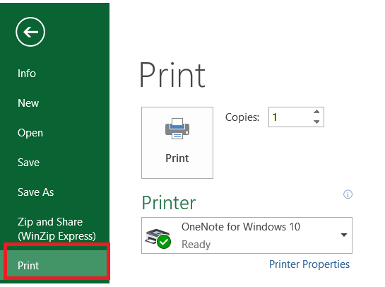
- Go to the “File” menu and click on “Print.”
- In the print preview window, you can set the page orientation (portrait or landscape) and choose the paper size.

- Adjust the margins if necessary to ensure that the graph fits appropriately on the printed page.

- Preview the changes by using the print preview option before finalizing the settings.
Printing the graph
Once you have set up the graph and adjusted the print settings, you are ready to print it. Here’s how:
- Click on the “Print” button in the print preview window.
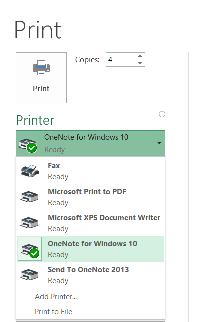
- Choose the printer you want to use and select any additional print options, such as the number of copies.
- Once all is set, click on the “Print” button to start printing.

Tips for Printing Graphs Effectively
To enhance the appearance and readability of your printed graphs, consider the following tips:
Selecting the appropriate graph size
Choose a size that allows the graph to be clearly visible when printed. Avoid making it too small or too large, as it may affect readability.
Using color and formatting options
Utilize colors and formatting options to make the graph visually appealing and distinguishable. However, ensure that the colors are printer-friendly and don’t lose clarity when printed.
Adding titles and labels
Include clear titles and labels on the graph to provide context and aid understanding. Ensure that the font size is readable when printed.
Adjusting margins and page layout
Adjust the margins and page layout to ensure the graph is centered and fits well on the printed page. Avoid cutting off any important elements due to incorrect margins.
Troubleshooting Common Issues while Printing Graphs
Sometimes, you may encounter issues while printing graphs in Excel. Here are a few common problems and their solutions:
Graph not fitting on a single page
If the graph is too large to fit on a single page, you can try the following options:
- Adjust the graph size or page layout settings to reduce its dimensions.
- Consider printing the graph on a larger paper size, such as legal or A3.
Poor print quality
If the printed graph appears blurry or pixelated, try the following solutions:
- Ensure that the printer settings are optimized for high-quality printing.
- Check the resolution of the graph image and consider using a higher resolution if necessary.
Missing elements in the printed graph
If certain elements of the graph, such as labels or data points, are missing in the printed version, check the following:
- Make sure that the graph is properly aligned within the printing area.
- Check if any elements are set to be hidden or invisible in the Excel settings.
Conclusion
Printing a graph in Excel is a straightforward process that can significantly enhance the way you present and analyze your data.
By following the steps outlined in this blog post, you can ensure that your graphs are accurately reproduced on paper, with clear labels, appropriate scaling, and proper formatting.
Remember to carefully consider your printing options, such as adjusting the page layout, choosing the right paper size, and utilizing print preview to make necessary adjustments before printing.
Additionally, take advantage of Excel’s customization features to add titles, legends, and annotations that enhance the visual impact of your graph. With practice and attention to detail, you’ll be able to create professional-looking graph printouts that effectively communicate your data insights to others.
So, go ahead and put your newfound knowledge into action, and enjoy the benefits of presenting your graphs in a tangible and visually appealing format.