Creating visually compelling and informative graphs is an essential skill for anyone working with data in Excel. When it comes to graph design, the position of the x-axis plays a crucial role in how data is interpreted and understood. By default, Excel places the x-axis in the middle of the graph, which may not always be ideal for optimal visualization.
However, fear not! In this comprehensive guide, we will explore the step-by-step process of moving the x-axis to the bottom of the graph in Excel, allowing you to create graphs that are not only visually appealing but also enhance the clarity of your data presentation.
Whether you’re a beginner or an experienced Excel user, mastering this technique will empower you to create impactful graphs that effectively communicate your data insights. So, let’s dive in and discover how to take your Excel graphing skills to the next level by repositioning the x-axis to the bottom!
Moving the X-Axis to the Bottom in Excel
Step 1: Organize Your Data
Before you dive into customizing your graph, it’s essential to ensure that your data is well-organized and prepared for visualization. Take the time to arrange your data in a logical and structured manner within your Excel worksheet. Consider the following tips for organizing your data effectively:
Sort your data: Arrange your data in a consistent order, such as ascending or descending, based on the variables you want to analyze. This helps establish a clear relationship between the data points.
Remove unnecessary information: Eliminate any redundant or extraneous data that doesn’t contribute to the main objective of your graph. Focus on including the essential variables and values that you want to visualize.
Group-related data: If your data consists of multiple categories or groups, consider grouping them together to facilitate easier analysis and interpretation. This grouping can be based on factors such as time periods, regions, or product categories.
By organizing your data thoughtfully, you lay a solid foundation for creating meaningful and visually appealing graphs that effectively convey your intended message.


Step 2: Adjust the X-Axis Position
The default positioning of the X axis in Excel may not always align with your visualization goals. By adjusting the X axis position, you can optimize the graph’s layout and improve its overall readability. Here’s how you can accomplish this:
Select the X-Axis
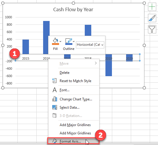
To begin modifying the X-axis, first, identify it on your graph. Typically, the X-axis is the horizontal axis at the bottom of the graph. Click on the X-axis to select it and prepare for further customization.
Format the X-Axis
To access the formatting options for the X axis, right-click on the selected X axis. A context menu will appear, providing various formatting choices. Select the “Format Axis” option to open a formatting window dedicated to the X axis.
Move the X-Axis
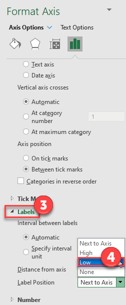
Within the “Format Axis” window, you’ll find an array of options to adjust the X-axis position. Look for settings such as “Axis Position,” “Horizontal Axis Crosses,” or “Axis Labels.” These settings enable you to shift the X-axis to your desired location.
Experiment with different positioning options to find the one that best suits your graph. In this case, we’ll switch it to the low position. Moving the X axis to the bottom of the graph often provides a clearer visual representation, especially when dealing with negative values on the Y axis.
Finalize the Adjustment
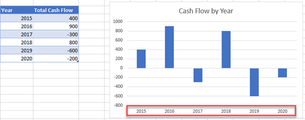
After making the necessary changes to the X-axis position, click “Apply” or “OK” to confirm the modifications. Take a moment to observe the updated graph, paying attention to how the X-axis labels have now been repositioned. By finalizing the adjustment, you improve the overall aesthetics and clarity of the graph, enhancing its effectiveness in conveying data insights.
Remember, the adjustment of the X-axis position is just one aspect of graph customization. Continue exploring various formatting options, such as axis labels, data markers, gridlines, and chart titles, to further refine the visual impact of your graph.
Conclusion:
In conclusion, by following the steps outlined in this tutorial, you can effectively move the x-axis to the bottom of your graphs in Excel. This simple adjustment significantly enhances graph clarity and improves the accessibility of your data. Remember to explore additional customization options and continuously refine your graph design skills to create visually captivating and impactful visualizations. With these techniques, you can effectively communicate your data insights and engage your audience with compelling graphs.