In the realm of data visualization within Microsoft Excel, the prominence of gridlines cannot be overstated. Gridlines serve as an invaluable aid, facilitating the comprehension of data and enabling users to decipher intricate patterns and relationships.
However, on occasion, the default gridline settings may fall short in terms of visibility, mainly when dealing with intricate datasets. This article elucidates two distinct methodologies through which the visual clarity of gridlines can be significantly augmented, thereby enhancing the overall user experience.
Method 1: Employing Excel’s Settings to Darken Gridlines
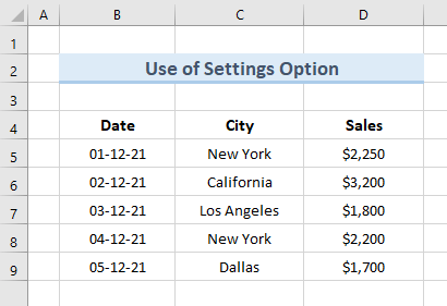
A precise and efficient means to enhance gridline visibility is by capitalizing on Excel’s intrinsic settings. When confronted with a dataset characterized by subtle gridlines, the objective is to intensify their appearance without compromising on data integrity. This method involves a series of deliberate steps, meticulously designed to amplify gridline prominence while maintaining data coherency. Here is a sample data that we’ll be working on to make the gridlines darker:
Step-by-Step Guide:
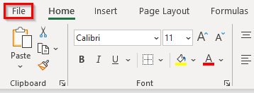
- Accessing File Tab: Commence by launching the Excel workbook containing the target dataset. Navigate to the top-left corner of the Excel window and click on the “File” tab.
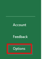
- Navigating to Options: From the dropdown menu, select the “Options” entry. This action will unveil a window housing a plethora of customizable settings.
- Exploring Advanced Settings: Within the new window, focus your attention on the left-hand side and identify the “Advanced” option. Click on it to access advanced customization options.
- Tweaking Display Options: As you direct your gaze to the right side of the window, scroll down until you locate the section labeled “Display options for this worksheet.”
- Opting for Deeper Gridlines: The crux of this technique lies in modifying the gridline color. Adjacent to the gridline color setting, you’ll encounter a dropdown menu. Delve into this menu and select a color option that leans towards the darker end of the spectrum.
- Confirmation and Implementation: Seal the deal by clicking on the “OK” button. This final step culminates the process, resulting in an adjusted visual representation of the dataset, characterized by more pronounced gridlines.

Upon completion of these sequential actions, the resultant visualization will showcase gridlines that exhibit a discernibly deeper shade, effectively elevating their visibility and, subsequently, the user’s ease of data interpretation.

Method 2: Darkening the Gridlines via Worksheet Borders
An alternative avenue for augmenting gridline visibility lies in the strategic implementation of borders within the worksheet. This approach entails the creation of a border framework enveloping the entire dataset, culminating in a visually distinct depiction of gridlines.
Procedure:
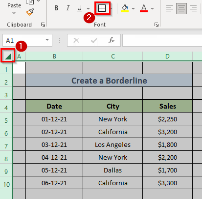
- Selecting the Triangle Icon: Begin by opening the Excel workbook containing the dataset. In the upper left corner of the worksheet, locate and click on the triangular icon.

- Navigating to the Home Tab: Transition to the “Home” tab situated atop the Excel interface.
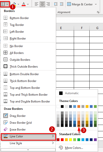
- Accessing the Borders Dropdown: Within the “Home” tab, shift your focus to the “Font” section. Here, you’ll find the “Borders” dropdown menu. Click on it to reveal a range of border customization options.
- Electing ‘All Borders’: Opt for the “All Borders” alternative from the dropdown list. This selection serves as the cornerstone of the method, initiating the formation of a comprehensive border arrangement.

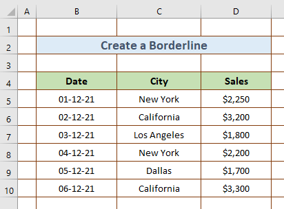
- Implementing the Border Framework: The preceding steps lay the foundation for a border framework that envelops each cell in the worksheet, effectively delineating the gridlines.

- Tailoring Gridline Color: Should customization of gridline color be desired, refer back to the “Borders” dropdown within the “Font” section. Explore the “Line Color” option and select a hue that harmonizes with your preferences.
- Selecting the Entire Worksheet: For a holistic application of the newly created border framework, revisit the triangle icon, which facilitates the selection of the entire worksheet.
- Finalizing Adjustments: Complete the process by selecting the “All Borders” icon within the ribbon.
This final step consummates the transformation, resulting in gridlines that not only boast increased prominence but are also aligned with the chosen color scheme.
Conclusion
In conclusion, the significance of well-defined gridlines within the realm of Excel data manipulation cannot be understated. By adhering to the meticulous guidelines outlined in this article, users can not only enhance the visual clarity of gridlines but also elevate the overall quality of their data interpretation endeavors. Whether through the adept utilization of Excel’s settings or the strategic deployment of border frameworks, the end result is a seamless synergy of aesthetic appeal and functional efficacy.