If you’re looking for an effective and visually appealing way to display your data, a dot plot can be an excellent choice. Dot plots are simple yet powerful tools that allow you to showcase the distribution and frequency of your data points.
And the best part? You can easily create a dot plot right in Microsoft Excel, one of the most widely used spreadsheet programs. In this blog post, we’ll guide you step-by-step on how to make a dot plot in Excel, enabling you to present your data in a clear and engaging manner.
Whether you’re a student, a professional, or just someone interested in data visualization, this tutorial will equip you with the knowledge and skills to create impressive dot plots using Excel’s features and functions. Let’s dive in and unlock the potential of your data with this comprehensive guide!
Understanding Dot Plots
What is a Dot Plot?
A dot plot, also known as a dot chart or a dot graph, is a visual representation of data points plotted along an axis. Each data point is represented by a dot, and the dots are placed in alignment with the corresponding values on the axis. Dot plots are particularly useful for displaying and comparing numerical data, showing the distribution and clustering of values.
Why Use a Dot Plot?
Dot plots offer several advantages over other visualization methods.
- Firstly, they provide a clear representation of individual data points, making it easy to identify outliers or unusual values.
- Additionally, dot plots allow for a compact display of data while retaining the ability to observe patterns, trends, and gaps in the distribution.
- They are also effective in showcasing the relationship between different data sets.
How to Interpret a Dot Plot?
Interpreting a dot plot is straightforward. The position of each dot on the plot corresponds to its value on the axis. By examining the distribution of dots, you can quickly identify the range, central tendency, and variation in the data.
Clusters or gaps in the dots reveal patterns or irregularities within the data set. Dot plots provide a visual summary that facilitates easy comprehension and comparison of data.
Creating a Dot Plot in Excel
Now let’s dive into the process of creating a dot plot in Excel. Follow these step-by-step instructions to harness the power of dot plots for your data analysis.
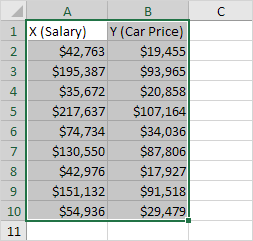
Step 1: Prepare the Data
To begin, ensure that your data is organized in a suitable format. The data should include a column or row for the categories or variables you want to plot along the axis. Arrange the corresponding values in a separate column or row. Make sure there are no blank cells or discrepancies in the data set as shown in the image below:

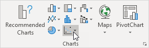
Step 2: Insert a Scatter Chart
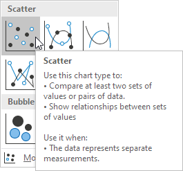
In Excel, creating a dot plot involves utilizing the scatter chart type. Select the data range you prepared in Step 1. Then, go to the “Insert” tab and click on the “Scatter” chart type.
Choose the desired scatter chart sub-type, such as markers only or markers with straight lines.
Step 3: Customize the Dot Plot
Once the scatter chart is inserted, you can customize the dot plot to enhance its visual appeal and effectiveness. Right-click on the horizontal axis and select “Format Axis” to modify the scale, labels, and other properties. Similarly, right-click on the vertical axis to adjust its properties. You’ll have your final result after inserting a dot plot like this:

Tips for Effective Dot Plots
To create impactful dot plots, keep the following tips in mind:
- Use Clear and Relevant Labels: Ensure that the labels on the axes and data points are concise, informative, and relevant to the data being plotted.
- Choose Appropriate Scale and Axis: Select a scale that accurately represents the range of your data. Consider using logarithmic scales if the data spans several orders of magnitude.
- Consider Grouping and Color Coding: If you have multiple categories or data series, group them together and use different colors or symbols to distinguish between them.
- Highlight Key Points and Trends: Use visual cues, such as bolding or enlarging certain data points, to emphasize important observations or trends in the data.
Common Mistakes to Avoid
While creating dot plots, it’s important to steer clear of common pitfalls that can lead to misleading or ineffective visualizations. Avoid the following mistakes:
- Overcrowding the Plot: Be mindful of overcrowding the plot with too many data points, as it can make it difficult to discern individual dots and patterns.
- Misrepresenting Data: Ensure that the scale and intervals on the axis accurately represent the data. Misrepresenting the data can lead to incorrect interpretations.
- Ignoring Data Distribution: Consider the distribution of data points and adjust the scale or axis accordingly. Ignoring the distribution can obscure valuable insights.
- Neglecting Formatting and Design: Pay attention to the overall formatting and design of the dot plot. Poor aesthetics can distract the reader and diminish the impact of the visualization.
Wrap Up
In conclusion, learning how to make a dot plot in Excel can be a valuable skill for anyone working with data visualization. By following the step-by-step guide outlined in this blog post, you can create clear and effective dot plots that convey information succinctly.
Dot plots are particularly useful for displaying categorical data and highlighting individual data points within a dataset. With Excel’s user-friendly interface and powerful charting capabilities, you have the tools at your disposal to create visually appealing dot plots that enhance your data analysis. So, dive in, practice, and start unlocking the potential of dot plots in Excel to bring your data to life.