As any seasoned Excel user knows, charts play a vital role in presenting data visually and making complex information more accessible. While Excel offers a myriad of customization options for charts, aligning them can sometimes prove to be a daunting task.
Whether you’re a business professional creating reports, a student working on a project, or simply an Excel enthusiast looking to enhance your data visualization skills, this step-by-step guide will walk you through the process of left-aligning your charts in Excel with ease and precision.
By the end of this tutorial, you’ll have the knowledge and confidence to effortlessly position your charts to the left of your worksheet, ensuring a polished and professional appearance. So, let’s dive right in and unlock the secrets to perfect alignment for your Excel charts!
Steps to Left Align a Chart in Excel
Let’s dive into the step-by-step process of left-aligning a chart in Excel.
Step 1: Add a Scattered Chart to Excel First
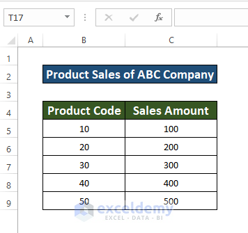
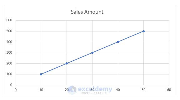
The first step is to insert a scattered chart using your dataset. For the purpose of this demonstration, let’s consider a dataset of Product Sales from ABC Company, with columns B and C representing Product Code and Sales Amount respectively, ranging from cells B4 to C9. Follow the instructions below to insert the scattered chart:
- Select the whole dataset: Highlight the cells that contain your data.
- Go to the Insert tab: Located in your Toolbar.
- Select the Scattered Chart: Choose the scattered chart option from the available chart types.
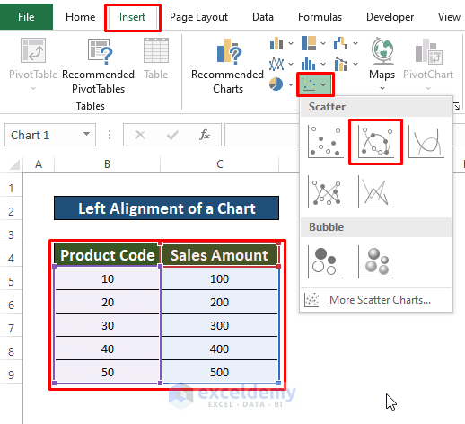
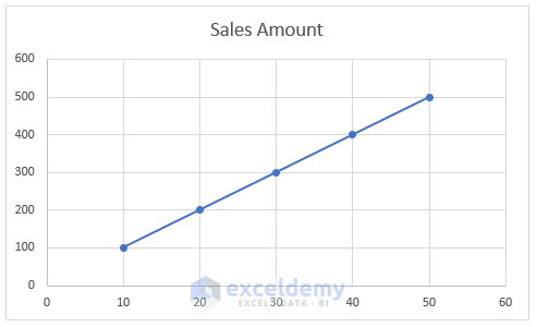
- Once you’ve completed these steps, you’ll have successfully inserted a scattered chart in Excel.
Step 2: Left Aligning Your Chart in Excel
Now that you have your chart, let’s align it to the left side for better visual presentation. Follow these instructions:
- Select the chart: Click on the chart to activate it.
- Identify the eight points around the chart: You will notice eight points surrounding the chart’s border.
- Select any of the three indicated points: Choose one of the three points on the left side of the chart.
- Drag the selected point: Click and drag the chosen point to the left.
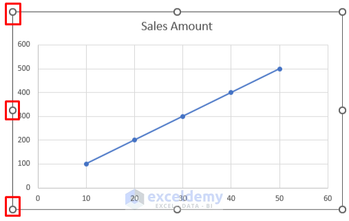
By following these steps, you’ll successfully align your chart to the left, giving it a more organized and professional look.

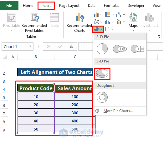
Left Alignment of Two Charts in Excel
If you have multiple charts and want to align them on the left side, follow these additional steps:
- Select the second chart: Apart from the scattered chart, select the whole data table to insert a pie chart.
- Go to the Insert tab: Located in your Toolbar.
- Select the Pie Chart: Choose the pie chart option from the available chart types.
- Select the 3-D Pie: Choose the appropriate layout for your pie chart.
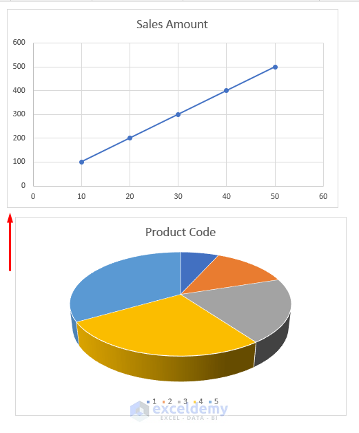
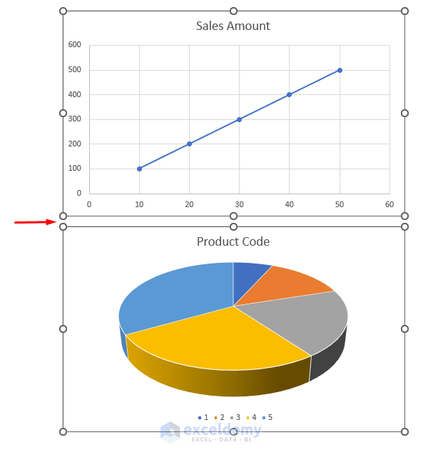
After completing the above steps, you’ll have a pie chart in addition to the scattered chart. However, you may notice that the pie chart is slightly displaced from the scattered chart on the right side.
Here’s how you can align both charts:
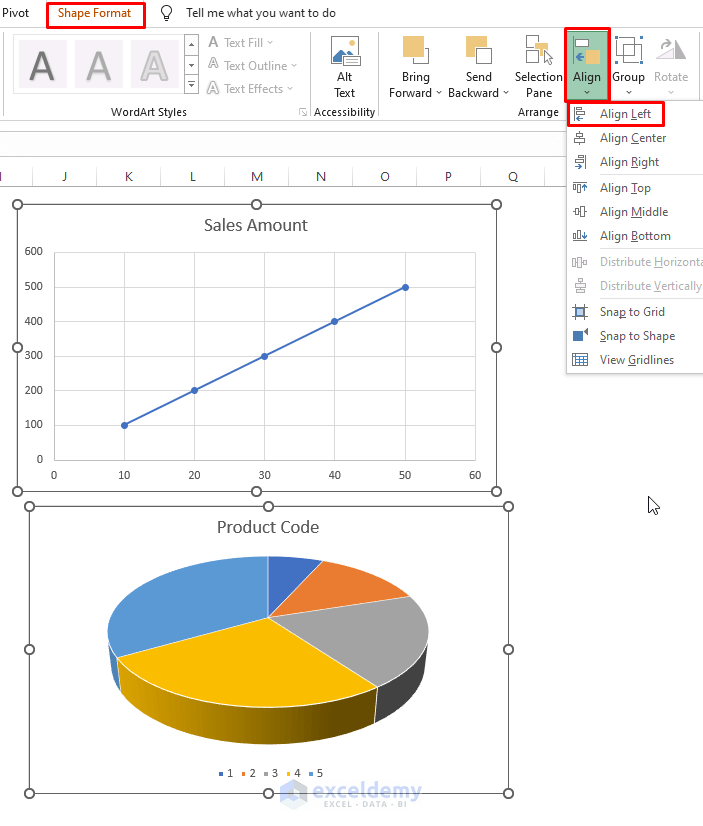
- Select a chart: Click on one of the charts.
- Select another chart: While holding the Shift key, click on the second chart to select both charts simultaneously.
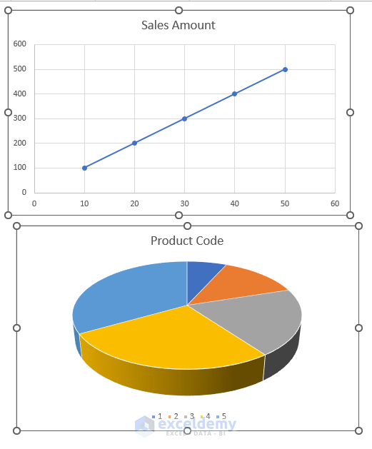
- Go to the Shape Format option: Located in your Toolbar.
- Select Align: Choose the alignment option.
- Press Align Left: This will align both charts perfectly on the left side.
Congratulations! You have successfully aligned your charts, providing a visually pleasing and coherent representation of your data.
The Bottom Line
In conclusion, left-aligning charts in Excel can significantly enhance the visual impact of your presentations and reports.
By following the step-by-step guide provided in this blog post, you have gained a solid understanding of the techniques and methods required to achieve precise chart alignment.
Remember to experiment with different chart styles, colors, and layouts to create visually appealing and informative charts that effectively communicate your data.
With these newfound skills, you can confidently create professional-looking reports, presentations, and projects that leave a lasting impression on your audience.
Excel’s flexibility and customization options make it a powerful tool for data visualization, and by utilizing left alignment, you can elevate your charts to new heights. So go ahead, apply what you’ve learned, and chart your way to success in Excel!