In today’s data-driven world, the ability to extract meaningful insights from raw information is a skill of paramount importance. Excel, the ubiquitous spreadsheet software, has long been a reliable companion for professionals, researchers, and enthusiasts seeking to make sense of their data. Among its myriad of features, one powerful tool stands out: trendlines.
These visual representations of data trends allow us to understand the underlying patterns and forecast potential future outcomes. However, as anyone who has delved into data analysis knows, trends don’t always end neatly at the edge of a chart. This is where the art of extending trendlines comes into play. In this illuminating blog post, we embark on a journey to unravel the intricacies of extending trendlines in Excel.
Whether you’re a seasoned analyst aiming to refine your data visualization skills or a novice eager to dive into the world of trend analysis, this guide will equip you with the knowledge and techniques needed to confidently navigate through Excel’s functionalities and extend trendlines with precision. Join us as we explore step-by-step instructions, best practices, and practical examples, transforming you into a proficient trendline extender in no time.
Understanding the Basics: Creating a Scatter Plot
Before we embark on our journey of trendline extension, it’s crucial to grasp the fundamentals. The starting point is creating a scatter plot, a visual representation of data points that showcases the relationship between two variables. Here’s a systematic approach to doing so:
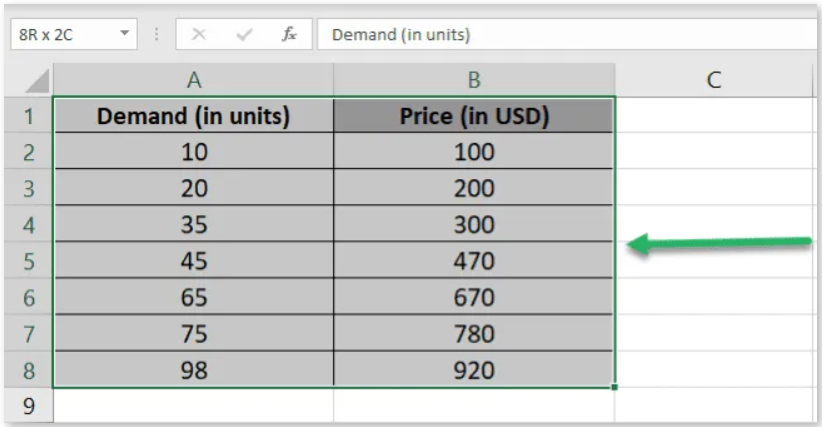
- Selecting the Dataset: Begin by identifying the dataset that contains the information you want to analyze. This dataset should include data points that reflect the interplay between price and demand.
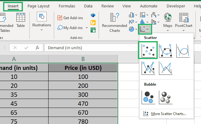
- Accessing the Insert Tab: Head to the “Insert” tab on the Excel ribbon, where a variety of charting options are at your disposal.
- Choosing the Scatter Chart: Within the “Charts” group, click on the scatter chart icon. This action will prompt a dropdown menu offering different scatter chart types.
- Creating the Scatter Plot: Select the “Simple Scatter chart” option from the dropdown.
- Excel will generate a scatter plot on your worksheet, with data points appropriately plotted.

Shedding Light on Relationships: Adding a Trendline
With the scatter plot in place, the next step involves introducing a trendline to decipher trends and patterns within the data. Here’s a methodical approach to achieving this:
- Selecting the Chart: Click on the scatter plot chart you’ve created. This action ensures that the chart is active and ready for further modification.

- Navigating to Trendline Options: On the right side of the chart, you’ll notice three icons that provide access to various chart elements. Click on the plus icon to reveal a dropdown menu.
- Incorporating the Trendline: From the dropdown menu, select the “Trendline” option.

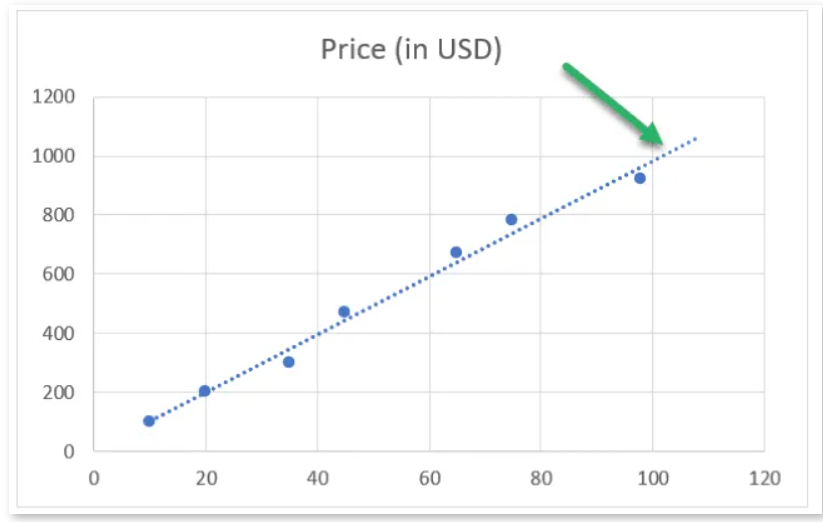
- A trendline will now be superimposed on your scatter plot, revealing the relationship between demand and price.

Extending the Trendline: Unveiling Future Trends
The true power of Excel’s trendline extension lies in its capability to predict future trends based on historical data. By extending the trendline, you gain insights into potential developments. Let’s explore this process:
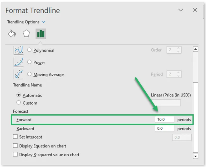
- Modifying the Existing Trendline: Begin by double-clicking on the trendline you’ve added. This action will open the “Format Pane” on the right side of the Excel sheet.

- Discovering Forecast Options: Within the “Format Pane,” navigate to the “Trendline Options” section. Here, you’ll find the “Forecast Options” that allow you to project future trends.

- Setting the Forward Period: Adjust the “Forward period” value to determine the length of the forecast. For instance, inputting a value of 10 will extend the trendline’s projection by 10 periods beyond the last data point.
The result is an extended trendline that provides a glimpse into the potential trajectory of the data’s relationship. By expanding the trendline forward, you can make informed predictions about future trends.
Looking Back: Extending the Trendline Historically
While forecasting future trends is invaluable, understanding historical patterns is equally crucial. Excel’s trendline extension capability extends backward as well, offering insights into past trends:
- Accessing the Trendline Format: Similar to the process for forward extension, double-click the trendline to activate the “Format Pane.”
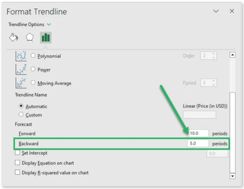
- Adjusting the Backward Period: Within the “Trendline Options” section of the “Format Pane,” locate the “Backward period” parameter. Modify this value to your desired number of periods such as 5.
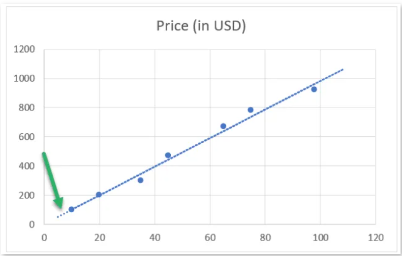
By extending the trendline backward, you gain insights into the historical trends that have shaped the data’s relationship over time.
Conclusion: Empowering Data Analysis
In conclusion, mastering trendline extension in Excel elevates your data analysis capabilities to new heights. By creating scatter plots, adding trendlines, and extending them both forward and backward, you unlock the potential to predict future trends and understand historical patterns.
Excel’s tools empower professionals to derive actionable insights from their data, making well-informed decisions that drive success. Whether you’re an analyst, researcher, or business strategist, the art of trendline extension equips you with the means to unravel the complexities of data trends and turn them into opportunities for growth.