Pie charts are a popular data visualization tool used to present categorical data in a visually appealing and easy-to-understand manner.
While pie charts can effectively showcase proportions and percentages, sometimes you may want to emphasize a particular slice or highlight specific data points for better clarity. That’s where the concept of exploding a pie chart comes into play.
Exploding a pie chart involves pulling out one or more slices to draw attention and provide a more impactful representation of your data. In this blog post, we will walk you through the step-by-step process of exploding a pie chart in Excel, enabling you to create eye-catching visuals that effectively communicate your message.
Whether you’re a beginner or an experienced Excel user, we’ve got you covered. So let’s dive right in and learn how to unleash the power of exploding pie charts to elevate your data presentations to the next level!
Exploding a Pie Chart in Excel | 2 Methods to Do So
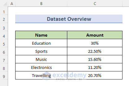
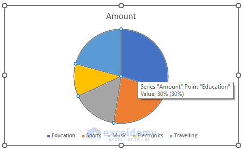
To explore the methods for exploding pie charts, we will first need a sample chart to work on. Here is an example of the data and its corresponding pie chart that we will be using in our methods:
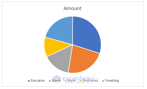
This is the pie chart for the above data
Method 1: Utilizing the Format Data Series Option to Explode Pie Charts
The first method is to use the built-in functions in Excel. Excel provides a built-in function to explode pie charts. You can follow these steps to utilize the “Format Data Series” option:
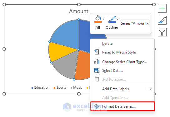
Step 1: Selecting the Pie Chart
Begin by selecting the pie chart and right-clicking on it.
Step 2: Accessing the Format Data Series Option
From the selection options, choose the “Format Data Series” option.
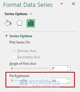
Step 3: Adjusting the Pie Explosion
Locate the “Pie Explosion” option within the “Format Data Series” panel.
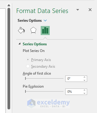
Step 4: Setting the Explosion Value
Adjust the “Pie Explosion” value to the desired percentage.
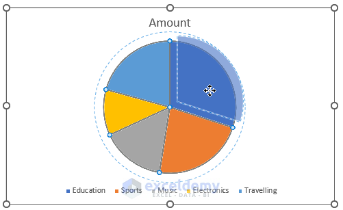
For example, we can set it to 20% in our case and here is the result of exploded pie chart after setting the percentage to 20%

Method 2: Exploding a Pie Chart in Excel Using the Mouse Cursor
You can also effectively explode a pie chart in Excel using the mouse cursor with these simple steps:
Step 1: Selecting the Pie Chart
Begin by selecting the pie chart using the mouse cursor.
Step 2: Dragging the Desired Portion
Drag the specific portion you wish to separate from the pie chart. For example, let’s say we want to isolate the portion representing “Traveling.”
Step 3: Separating the Portion
Move the separated portion to the desired distance away from the pie chart.

By following this process, you can explode multiple portions as needed. For instance, in our example, we will explore the “Traveling,” “Music,” and “Electronics” portions. This method proves particularly useful when descriptive text needs to accompany the exploded pie chart.

By manipulating the “Pie Explosion” value, you can create an exploded pie chart with evenly separated portions. This method offers a visually appealing and organized representation of the data.
Key Considerations
When working with exploded pie charts in Excel, it is important to keep the following points in mind:
- Drag-and-Drop Method: Exploding pie charts by dragging with the cursor may result in uneven scattering of the plot portions. However, this method proves advantageous when including descriptive text alongside the pie chart.
- Format Data Series Method: Utilizing the “Format Data Series” option ensures even separation of the pie chart portions. This method yields visually appealing and well-organized data representation.
- Pie Explosion Percentage: Higher values in the “Pie Explosion” setting may cause the pie portions to shorten in order to maintain the desired distance within the chart area.
- Applicability to 3-D Pie Charts: Both methods discussed above are applicable not only to 2-D pie charts but also to 3-D pie charts.
Conclusion
In conclusion, mastering the technique of exploding pie charts in Excel can greatly enhance your data visualizations and make them more engaging and impactful. By following the step-by-step instructions provided in this guide, you now have the knowledge and skills to effectively explode pie charts, drawing attention to specific data points and delivering your message with clarity.
Remember to consider the purpose and context of your chart when deciding which slices to explode, ensuring that it adds value to your overall presentation. Experiment with different explosion settings, colors, and labels to create visually stunning and informative charts that captivate your audience.
Excel provides a versatile platform for data analysis and visualization, and by harnessing the power of exploding pie charts, you can take your Excel skills to the next level. So go ahead, unleash your creativity, and let your data tell a compelling story through exploded pie charts in Excel. Happy charting!