Waterfall charts in Excel offer a valuable way to visualize cumulative data and track incremental changes over a period of time. Whether you’re an experienced data analyst looking to expand your skills or a newcomer to Excel, learning how to create waterfall charts can enhance your ability to present and analyze data effectively.
In this blog post, we will provide you with a comprehensive and easy-to-follow tutorial on crafting waterfall charts in Excel. By the end, you’ll have a clear understanding of how to utilize this chart type to showcase the progression of data in a clear and insightful manner.
Understanding the Waterfall Chart’s Essence
A waterfall chart in Excel is a visual representation that helps illustrate the incremental changes in a dataset over a particular time period or category. This unique chart type is particularly useful for showcasing how different factors contribute to a final outcome. Each column in a waterfall chart represents a data point, and the chart displays both positive and negative values, creating a cascading effect that resembles a waterfall.
The initial and final values are shown as the starting and ending points, while the intermediate columns represent the positive or negative changes. Waterfall charts are valuable tools for analyzing financial data, identifying trends, and comprehending the cumulative impact of various elements within a dataset, all presented in a clear and concise visual format within Excel.
Create a Waterfall Chart in Excel – Step-by-Step Guide
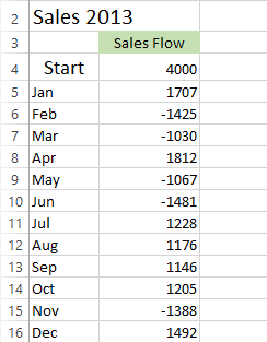
Create a simple table with positive and negative sales values to grasp the concept better. The table below that were gonna use as a sample in our guide displays sales growth in some months and a decline in others compared to the start position.
Step 1: Data Table Transformation
To embark on your waterfall chart creation journey, you’ll first need to transform your data table to accommodate the unique structure of a waterfall chart. This involves adding three crucial columns: Base, Fall, and Rise. Here’s how to proceed:
- Introduce Additional Columns: Open your Excel table and insert three new columns: Base, Fall, and Rise. These columns will play a pivotal role in shaping the foundation of your waterfall chart.
- Segregate Data: Organize your data into these columns. Negative values from the Sales Flow column should be placed in the Fall column, while positive values should populate the Rise column.
- Yearly Overview: Extend your Month list by appending the End row at the bottom. This addition will enable you to calculate the annual sales total effectively.

Step 2: Formulas for Accuracy
Formulas are the backbone of your waterfall chart construction. Employ the following formulas to ensure precise data representation:
- Converting Negative Values: In cell C4 of the Fall column, input the formula: =IF(E4<=0, -E4, 0). This formula ensures that negative values are displayed as positive, while positive values remain as zeros.

- Handling Positive Values: In cell D4, use the formula: =IF(E4>0, E4, 0). This formula clearly presents positive values as positive and negative values as zeros.

- Calculating Base Values: To establish a solid base for your waterfall chart, employ the formula =B4+D4-C5 in cell B5. This calculation provides the necessary foundation for the rises and falls in your chart.

Step 3: Crafting the Stacked Column Chart
With your data primed for visualization, it’s time to construct the initial structure of your waterfall chart. Follow these steps:
- Data Selection: Highlight your data, ensuring to exclude the Sales Flow column.
- Chart Creation: Navigate to the INSERT tab and locate the Charts group. Click on the Insert Column Chart icon and select Stacked Column from the available options.

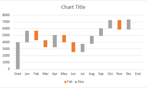
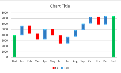
Your chart might look like this:

Now this appears as a simple graph, your next step is to transform it into a waterfall chart;
Step 4: The Transformation: Stacked Column to Waterfall Chart
Unlock the transformation process that turns your stacked column chart into a compelling waterfall visualization:
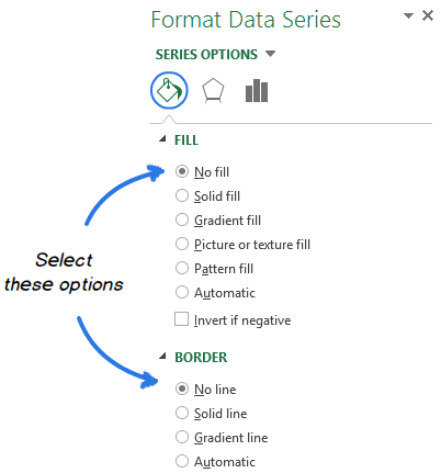
- Invisibility Technique: Right-click on the Base series within the chart. From the ensuing context menu, select the Format Data Series… option.

- Formatting the Series: Inside the Format Data Series pane, focus on the Fill & Line icon. Opt for No fill in the Fill section and No line in the Border section. This step renders the Base series invisible.
- Bid Farewell to Base: Remove the Base series from the chart legend. This action eliminates any traces of the Base series, leaving your chart with the distinct characteristics of a waterfall chart.
Step 5: Enhancing Aesthetics and Clarity
Fine-tune your Excel bridge chart to enhance its visual appeal and clarity. Follow these steps:
- Vibrant Representation: Highlight the Fall series within the chart. Navigate to the FORMAT tab under CHART TOOLS and click on Shape Fill in the Shape Styles group. Choose a color that effectively differentiates the Fall series.
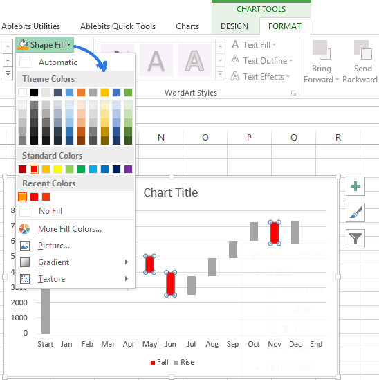
- Consistency is Key: Apply the chosen color to the Rise series as well, maintaining a consistent color scheme. Additionally, color-code the Start and End columns using the same chosen color.
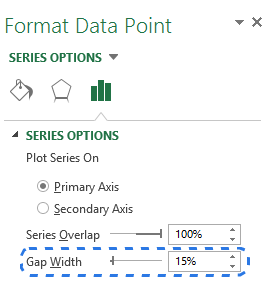
- Optimal Spacing: Eliminate excess white spaces between columns to improve the chart’s compactness. Double-click on any chart column to access the Format Data Series pane. Adjust the Gap Width to a narrower setting, such as 15%.
Step 6: Enhance Readability with Data Labels
For enhanced data interpretation, augment your waterfall chart with data labels. Here’s how:
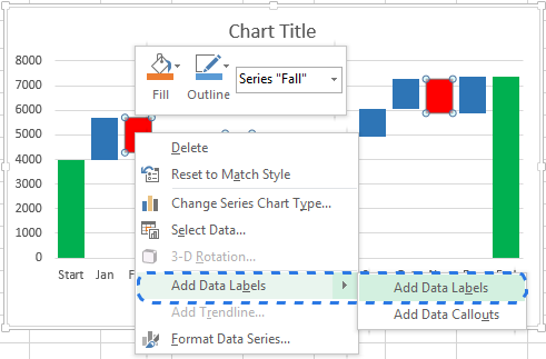
- Label Implementation: Right-click on the series you wish to label and select the Add Data Labels option from the context menu.
- Fine-tuning Labels: Adjust label settings to improve readability. You can modify the label position, text font, and color to ensure optimal comprehension.
Step 7: Final Touches and Adjustments
As you approach the final stages of creating your waterfall chart, take a few additional steps to refine and enhance your visualization:
- Simplify and Cleanse: Eliminate zero values and the legend from the chart. This decluttering process helps direct focus to the essential elements of your waterfall chart.
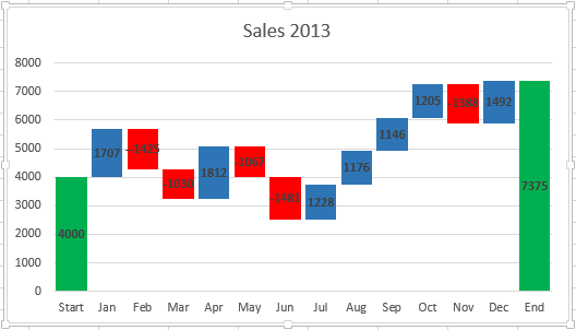
- Descriptive Chart Title: Update the default chart title with a descriptive and informative alternative. A well-crafted chart title provides context and helps your audience understand the purpose of your chart. Once you’re done with everything, your waterfall chart will look like this:
Conclusion
In conclusion, mastering the art of creating waterfall charts in Excel equips you with a powerful tool for communicating complex data patterns. By following the detailed steps and techniques outlined in this guide, you can consistently produce impactful waterfall charts that offer invaluable insights and enhance data-driven decision-making. Whether you’re analyzing financial trends, project progress, or any other data-driven scenario, waterfall charts can be your go-to visualization choice.