In the realm of data visualization, Excel remains a powerhouse tool, offering a myriad of ways to represent data effectively. Among its arsenal of chart types, the bubble chart stands out as a versatile and insightful option.
In this article, we delve into the significance of bubble charts in Excel, when to use them, their pros and cons, and a step-by-step guide to create them.
Understanding the Significance of Bubble Charts in Excel:
Bubble charts are dynamic visualizations that display three dimensions of data: x-axis, y-axis, and size of the bubbles. They excel in presenting complex datasets with multiple variables, making it easier to identify patterns, trends, and correlations.
Unlike traditional charts like bar or line graphs, bubble charts offer a more holistic view of the data by incorporating additional dimensions.
Step-by-Step Guide to Creating Bubble Charts in Excel:
Step 1: Prepare Your Data
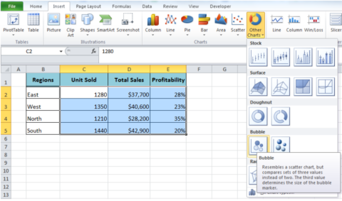
Ensure your data is organized with columns representing the x-axis, y-axis, and bubble size. Each row should represent a data point.
Step 2: Select Data and Insert Chart
Select your data range, including headers, and navigate to the ‘Insert’ tab. Choose ‘Insert Scatter (X, Y) or Bubble Chart’ and select the ‘Bubble’ option.
Step 3: Customize Your Chart
Once the chart is inserted, you can customize it further. Right-click on the chart elements to access formatting options such as axis labels, titles, and legends.

Step 4: Adjust Bubble Sizes
To adjust the bubble sizes based on your data, click on any bubble within the chart. Then, navigate to the ‘Format Data Series’ pane and adjust the bubble size options.
Step 5: Fine-Tune Appearance
Fine-tune the appearance of your chart by adjusting colors, borders, and gridlines to enhance readability and visual appeal.
Step 6: Add Additional Elements
Consider adding additional elements such as data labels or trend lines to provide further insights into your data.
Step 7: Finalize and Analyze
Review your bubble chart to ensure it effectively communicates your data. Analyze the chart to identify patterns, trends, and correlations.
By following these steps, you can create informative and visually appealing bubble charts in Excel, enabling you to explore and communicate complex datasets with ease.

When to Use Bubble Charts:
-
Comparative Analysis:
Bubble charts are ideal for comparing multiple sets of data simultaneously. They allow users to assess relationships between different variables within the same chart.
-
Trend Identification:
They are effective in identifying trends and outliers within a dataset. By analyzing the position and size of bubbles, users can spot deviations and anomalies easily.
-
Correlation Visualization:
Bubble charts excel in illustrating correlations between variables. The proximity of bubbles to each other can indicate strong or weak correlations.
-
Size Representation:
The size of bubbles in the chart can represent another dimension of data, such as revenue, population, or market share, providing additional insights at a glance.
Pros and Cons of Bubble Charts:
Pros:
-
Visual Appeal:
Bubble charts are visually engaging, making it easier for stakeholders to grasp complex data quickly.
-
Multivariate Representation:
They can represent multiple variables simultaneously, offering a comprehensive view of the dataset.
-
Trend Identification:
Bubble charts facilitate trend identification and outlier detection, aiding in data analysis and decision-making.
Cons:
-
Complexity:
With multiple variables and bubbles, bubble charts can become complex, potentially overwhelming users with too much information.
-
Limited Scale:
Bubble charts may not be suitable for large datasets or datasets with highly varied scales, as it can distort the representation of data.
-
Interpretation Challenges:
Interpretation of bubble charts requires some level of data literacy, as users need to understand the relationships between variables represented by the bubbles.
Conclusion:
In conclusion, Excel bubble charts are powerful data visualization tools, offering a holistic view of multidimensional datasets. Understanding their significance, applications, and nuances equips users to leverage them effectively in data analysis and decision-making processes.
With the step-by-step guide provided, mastering bubble charts in Excel becomes attainable, unlocking new insights and perspectives within your data.
