In today’s data-driven world, the ability to effectively visualize and interpret data is a critical skill for professionals across various industries. Among the myriad of data visualization techniques, scatter plots stand out as powerful tools for identifying relationships and trends within datasets. However, what if your analysis requires combining multiple scatter plots into a single cohesive visualization?
Fear not, as this guide is here to demystify the process of merging scatter plots using one of the most widely accessible and versatile tools: Microsoft Excel. Whether you’re an analyst seeking to uncover hidden insights or a student navigating the intricacies of data representation, this step-by-step exploration will equip you with the knowledge and techniques needed to harness the true potential of scatter plot combinations.
From understanding the fundamentals of scatter plots to mastering advanced Excel functions, this comprehensive journey will empower you to transform raw data into compelling visual narratives. Join us as we delve into the art and science of amalgamating scatter plots, unlocking new dimensions of understanding within your data and elevating your proficiency in Excel-driven data visualization.
Step 1: Navigating the Charts Ribbon and Select Scatter Plot
- To begin, open your Excel file and navigate to the “Insert” tab located on the Ribbon.
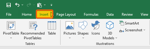
- Click on the “Charts” option in the Ribbon to access various chart types.
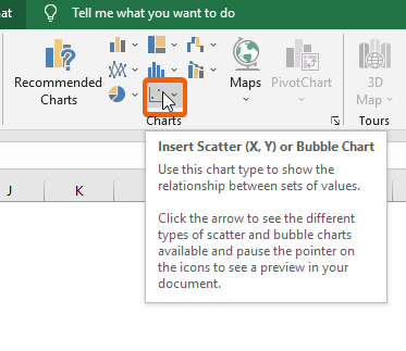
- From the dropdown, select the “Scatter” option that best fits the layout you prefer.

- Double-click within the chart area to reveal the Chart Tools for customization.

Step 2: Creating the First Scatter Plot by Selecting Data
- After setting up the chart, click on the chart to activate the Chart Tools.
- Select the “Design” tab in the Chart Tools section.
- Under the “Data” group, click on “Select Data.”

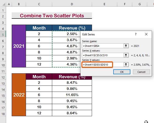
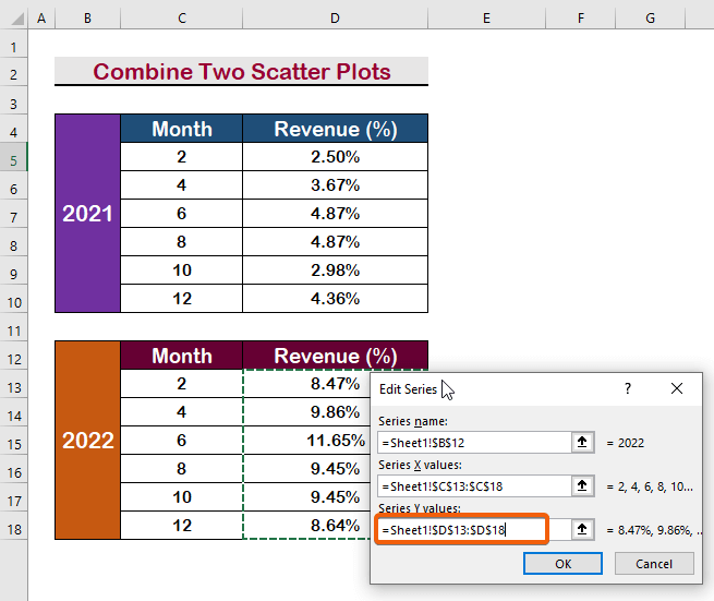
- In the “Select Data Source” window, click the “Add” button to add a new data series.

- In the “Edit Series” dialog box, enter a name for the series in the “Series name” field. For instance, you can use ‘2021’ as the series name.

- In the “Series X values” field, select the data range that represents the X-axis values. For example, you can choose the range C5:C10.

- In the “Series Y values” field, select the data range for the Y-axis values. For instance, choose the range D5:D10.
- Press Enter to confirm your selections and create the first scatter plot.
Step 3: Adding Another Series for Combination
To add another series to your scatter plot, repeat the steps above.
- Click on the “Add” button in the “Select Data Source” window.
- Enter a new series name in the “Series name” field.

- Select the appropriate data range for the X-axis values
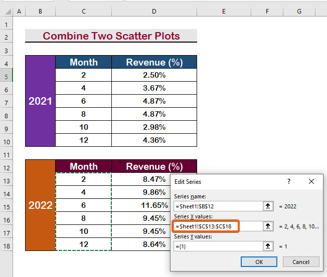
- Now for the y-axis values
- Press Enter to confirm and create the second scatter plot series.
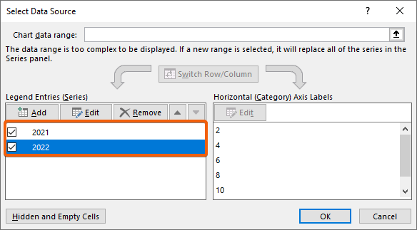
- Now you’ll have two scatter plots in one frame
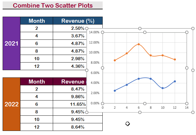
Step 4: Enhancing the Layout of Combined Scatter Plots
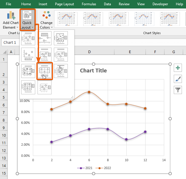
- Choose a Layout: Opt for a more visually appealing layout that suits your data presentation.
- Quick Layout Option: Find the “Quick Layout” option and select a suitable layout style. Our example utilizes Layout 8 for reference.
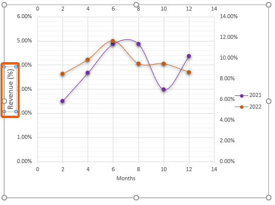
Step 5: Integrating Secondary Horizontal/Vertical Axis
- Add Secondary Horizontal Axis: Click “Add Chart Element,” then select “Axis,” and finally, choose “Secondary Horizontal.”
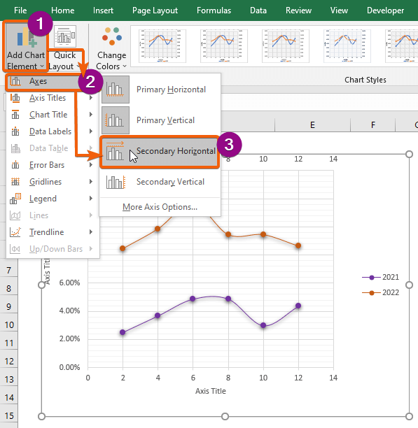
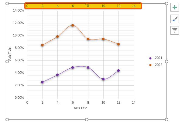
- You’ll notice that the secondary horizontal axis has appeared on the graph.
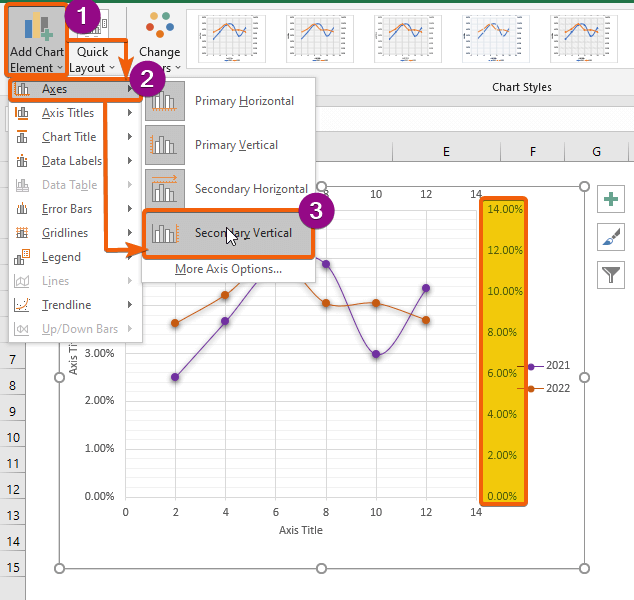
- Vertical Axis Inclusion: Similarly, select the “Secondary Vertical” option from the Axis menu to add an extra Vertical Axis on the right side of the chart.
- Title Customization: Double-click on the Axis title boxes to rename them according to your preference. For the Horizontal Axis, you might use “Months,”
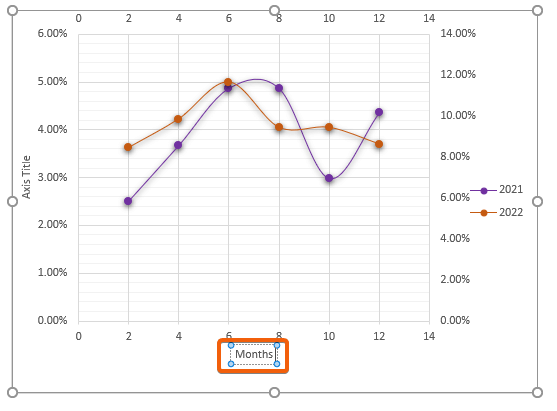
- and for the Vertical Axis, you can use “Revenue (%).”
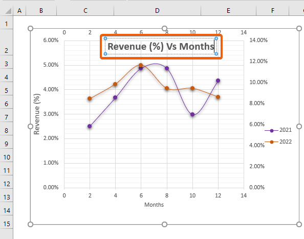
Step 6: Introducing a Chart Title to Your Combined Scatter Plots
- Chart Title Inclusion: Click “Add Chart Element,” then select “Chart Title,” and choose where you want to display the Chart Title (e.g., “Above Chart”).
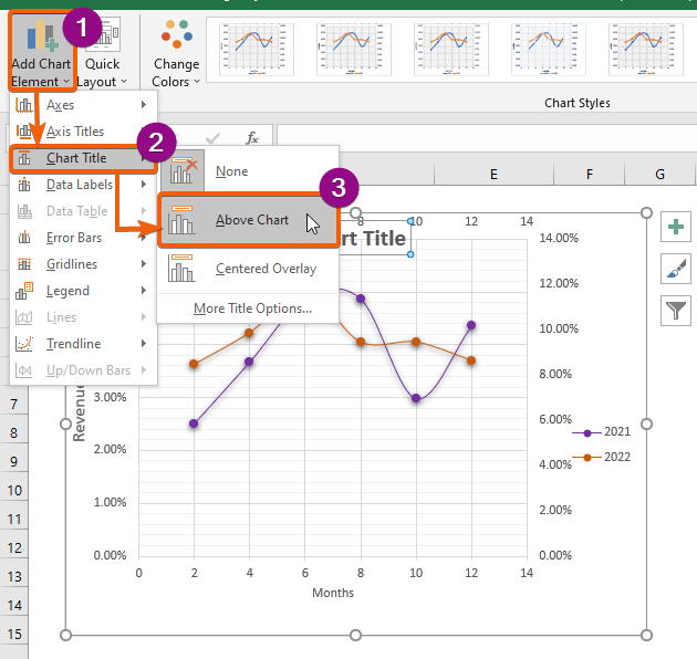
- Title Input: Double-click the box and type the desired Chart Title, such as “Revenue (%) Vs Months.”
Step 7: Displaying Data Labels on Combined Scatter Plots
- Now to Activate Data Labels Click on “Data Labels.”
- From the Label Display Options Choose how you want to display the labels, such as “Below.”
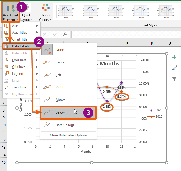
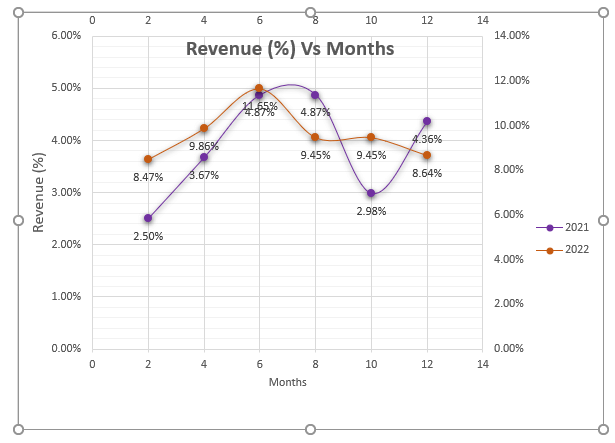
- You’ll have your scatter plots combined like this:
Conclusion
Combining scatter plots in Excel is a powerful way to present complex data relationships in a clear and understandable manner. By following these step-by-step instructions, you can create impressive visualizations that effectively communicate your data’s insights.
Excel’s built-in features, such as selecting data, adjusting the layout, and adding titles and labels, enable you to craft professional-looking scatter plots that provide valuable information at a glance. Whether you’re presenting data to colleagues or clients, mastering the art of combining scatter plots will undoubtedly enhance your data storytelling skills.