Graphs serve as indispensable visual tools for data analysis, enabling users to identify trends, communicate insights, and guide decision-making. Their power lies in apt representation – thus, modifying the horizontal X-axis stands as a fundamental skill for customizing graphs to showcase information precisely.
Mastering techniques to change X-axis values in Excel empowers users to fine-tune visuals, accentuate relevance, and derive deeper meaning from data. This guide will illuminate methods to alter X-values through right-clicking, interval adjustment, and other advanced features – unlocking customization abilities that transform raw data into impactful graphical depictions. Equipped with these Excel skills, professionals across industries can showcase figures as accurate reflections of the narrative they wish the data to tell.
Understanding the Role of X-axis Modification
Before delving into the intricacies of the techniques, it’s imperative to grasp the significance of altering X-axis values. The X-axis, representing the horizontal dimension, serves as the foundation of graph interpretation. Adjusting these values empowers users to tailor visual representations, fostering a deeper understanding of the data at hand. This fine-tuning not only enhances the aesthetic appeal of graphs but also ensures precision and relevance in conveying the intended message.
Methods to Change Horizontal Axis Values in Excel
1. Right-Click Method: Streamlining the Process
- Open the Excel/Spreadsheet WPS file containing the target graph.
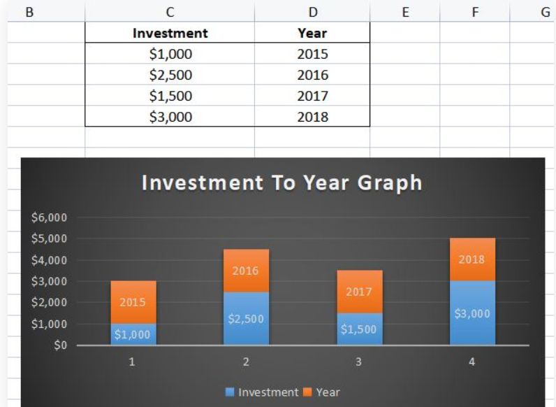
- Right-click on the X-axis of the graph, unveiling a context menu with diverse options.
- Opt for the ‘Select Data’ option, triggering the appearance of a new window.
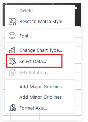
- Within the ‘Axis Labels (Category),’ locate and click ‘Edit,’ ushering in the ‘Axis Labels’ window.

- Dynamically highlight your desired range of data (values) for the X-axis using the provided button.

- Upon selection, either click the same button or press Enter to confirm.

- Finalize the process by clicking ‘OK,’ witnessing the seamless transformation of your graph’s X-axis values based on the selected range.

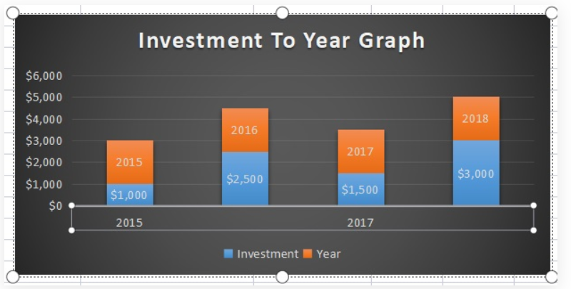
2. Interval Adjustment for Text-Based X-axis Values: Precision in Detail
For scenarios where X-axis values are text-based, adhere to the following steps:
- Open the Excel/Spreadsheet WPS file housing the pertinent graph.

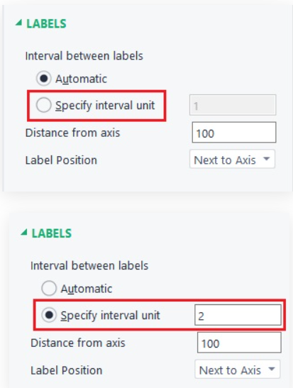
- Right-click on the X-axis, initiating the ‘Format Axis’ option.

- Engage with the ‘Axis Options’ button and navigate to ‘Labels.’

- Opt for ‘Specify interval unit’ under ‘Interval between labels,’ entering your preferred interval value in the designated box.
- Close the window, and witness the X-axis values seamlessly adapting to the specified changes.
Unleashing Advanced Graph Customization Techniques
While mastering the fundamentals is crucial, delving into advanced customization features elevates your ability to create visually stunning and highly informative graphs.
1. Customizing Axis Labels: Infusing Personality into Your Graphs
To add a personal touch to your graphs, consider the following steps:
- Open the Excel/Spreadsheet WPS file housing the graph of interest.
- Right-click on the axis label you wish to personalize.
- Choose ‘Format Axis Label’ and embark on modifying the label according to your unique preferences.
2. Changing Data Series Names: Precision in Data Representation
For a more comprehensive overview, altering data series names can significantly enhance clarity:
- In the Excel/Spreadsheet WPS file, click on the data series name you intend to change.
- Input the new name directly, providing a clearer representation of your data series.
Going Beyond: Enhancing Your Excel Mastery
To truly master Excel and its graphing capabilities, consider these additional tips:
1. Utilizing Trendlines for Predictive Analysis
Explore the use of trendlines to make predictions based on existing data trends. Right-click on your data series, select ‘Add Trendline,’ and choose the type that best fits your data.
2. Incorporating Secondary Axes for Dual Representations
When dealing with datasets of varying scales, consider adding a secondary axis. This ensures that multiple sets of data can be accurately represented on a single graph, providing a comprehensive view.
3. Utilizing Data Labels for Clarity
Enhance the clarity of your graphs by incorporating data labels. This provides viewers with specific data points directly on the graph, minimizing the need for reference to raw data.
In Conclusion: Empowering Your Data Visualization Journey
Learning how to change horizontal axis values in Excel/Spreadsheet WPS not only streamlines your workflow but also empowers you to elevate your data visualization skills to new heights. Whether opting for the user-friendly right-click method or fine-tuning text-based intervals, a profound understanding of these techniques unlocks the full potential of graph customization.
In a world fueled by data-driven decisions, the ability to present information effectively is a coveted skill. By following these steps, you not only enhance your proficiency in Excel but also contribute to creating visually compelling and accurate representations of your data.