Unraveling the insights hidden within survey data can significantly impact your decision-making process. Fortunately, Excel provides a robust platform to analyze and interpret data effectively. In this comprehensive guide, we will walk you through the process of analyzing survey data using Excel, empowering you to make well-informed choices based on real data.
Understanding the Importance of Survey Data
Survey data is a valuable resource for individuals, businesses, and organizations seeking to understand the preferences, opinions, and behaviors of their target audience. Proper analysis of survey data can lead to better strategies, improved products, and enhanced customer satisfaction.
Step 1: Organizing Your Data for Precise Counting
Before delving into the analysis, it’s crucial to structure your Excel sheet for accurate counting. Follow these essential steps to prepare your data:
Filtering Blank Rows: Select the relevant data columns, navigate to the “Data” tab in the ribbon, choose “Filter” and select “Blanks”.
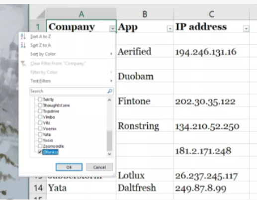
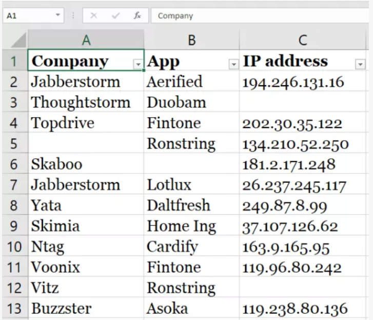
By selecting the “Blanks” option, you can identify and remove all empty data rows, leaving you with a clean dataset like this.
Counting Different Types of Feedback: With your data organized, you can now count the different types of feedback received. Determine the number of blank cells and non-blank cells to gauge the response rate for each survey question. This will help you gauge the effectiveness of your questions and understand audience engagement as shown in the image below.

Step 2: Calculating the Percentage of Feedback
Calculating percentages for each type of feedback offers deeper insights into the survey results. To calculate the percentages, follow these steps:
- Summing Total Feedback: Utilize the formula =A/$B$b to calculate the total feedback received. Format the result as a percentage by right-clicking, selecting “Format Cells,” and choosing the “Percentage” option.
- Calculating Specific Feedback Percentage: Input the formula =B8/$B$12 in your Excel sheet, where B8 represents the cell with the specific feedback you want to count, and $B$12 indicates the cell with the total number of feedback.
Your result will look like this:

Step 3: Unveiling Relationships through Correlation
Understanding the correlation between different variables is crucial for data analysis. Excel facilitates correlation calculations, enabling you to compare two sets of data like this:

Follow these steps to perform correlation analysis:
- Selecting Variables: Choose a blank cell and enter the formula =CORREL(A2:A7, B2:B7), where A2:A7 and B2:B7 are the two variable lists you want to compare.

- Visualizing Correlation: Enhance comprehension by creating a chart that displays the correlation result. Charts provide a quick overview of the relationship between variables.

Step 4: Visualizing Data through Charts and Graphs
Presenting survey data in a visually appealing manner enhances its impact and facilitates data interpretation. Excel offers a range of chart types that cater to various data representations. Follow these steps to create charts and graphs:
- Selecting Chart Type: From the “Insert” menu, choose the appropriate chart type based on your data. Pie charts, diagrams, histograms, and line graphs are some popular options.
- Comprehensive Visualization: Ensure that the selected chart accurately represents the data and offers a comprehensive view of the survey results.

Tips for Effective Survey Data Analysis
Effective survey data analysis is essential to extract valuable insights that can drive meaningful decisions. To achieve accurate and actionable results, consider the following tips:
Define Clear Objectives
Before diving into the analysis, it’s crucial to establish clear and well-defined objectives for the survey. Clearly outline the purpose and goals of the study to ensure that the analysis remains focused and relevant. Having a well-defined framework will guide the entire process and help in interpreting the results effectively.
Choose Appropriate Analysis Techniques
Selecting the right analysis techniques is vital in obtaining meaningful results. Evaluate the type of data collected and the specific research questions at hand. Different types of data may require distinct analytical approaches, such as descriptive statistics, regression analysis, or clustering methods. By choosing the most suitable techniques, you can extract deeper insights from the data.
Collaborate with Experts
Seek collaboration with subject matter experts during the analysis process. Their expertise and domain knowledge can provide valuable perspectives and interpretations of the data. Collaborating with experts ensures a comprehensive understanding of the survey data and validates the findings, enhancing the overall credibility of the analysis.
Conclusion
In conclusion, mastering survey data analysis in Excel empowers you to extract valuable insights from your survey responses. By following the steps outlined in this guide, you can effectively organize your data, calculate percentages, understand correlations, and visualize the results. Excel serves as an invaluable tool for making data-driven decisions, propelling your business or research forward. Happy analyzing!