Are you looking to enhance the clarity and readability of your Excel charts? One powerful tool at your disposal is the legend feature in Excel. Legends provide a visual guide that helps viewers interpret the various data series or categories presented in your charts.
Whether you are a data analyst, a business professional, or a student, understanding how to add a legend in Excel is a valuable skill that can elevate your data visualization and make your charts more impactful. In this comprehensive guide, we will walk you through the step-by-step process of adding a legend to your Excel charts, ensuring that you have the knowledge and expertise to create visually appealing and informative charts.
From understanding the importance of legends to customizing their appearance, we will cover all the essential aspects to help you master this essential Excel feature. So, let’s dive in and learn how to add a legend in Excel like a pro!
Understanding the Importance of a Legend
A legend serves as a key that helps users interpret the different elements within a chart or graph. It provides clarity by labeling the various series, categories, or data points present in the visualization.
By providing labels for each element in the chart, the legend eliminates confusion and ensures that viewers can easily understand and interpret the information being presented. In addition to enhancing readability, a well-designed legend improves the overall understanding of the data. It provides context and allows viewers to quickly identify and compare the different elements within the chart.
This makes it easier to draw meaningful insights and make informed decisions based on the information presented. Overall, incorporating a legend in Excel charts is vital for effective communication and ensuring that the data is accurately and comprehensively represented.
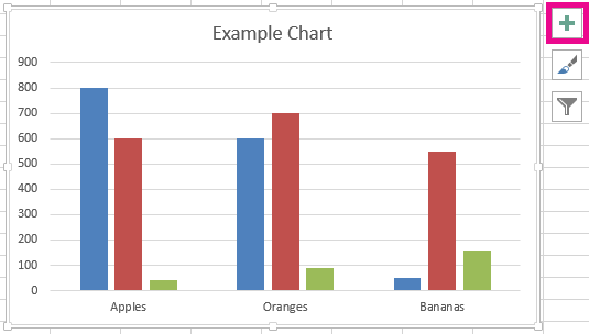
Creating a Chart in Excel
To add a legend to your Excel spreadsheet, you first need to create a chart. Follow these steps:
- Select the data range you want to include in the chart.
- Click on the “Insert” tab in the Excel ribbon.
- Choose the type of chart you want to create from the available options.
- Excel will generate a basic chart based on your data.
Formatting the Chart
Before adding a legend, it’s important to format the chart to ensure it accurately represents your data. You can customize the chart elements, such as axes, titles, labels, and colors, to enhance its visual appeal and readability.

Adding a Legend in Excel
Once you have your chart all set, you can now follow these steps to add a legend to your Excel chart:
Step 1: Open your Excel workbook
Launch Microsoft Excel and open the workbook containing the chart you want to modify.
Step 2: Select the chart
Click on the chart to select it. The chart area will be highlighted, indicating that it is active.

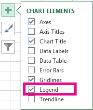
Step 3: Click on “Add Chart Element”
Within the chart, you will see a group of buttons at the top right corner. Locate the “Add Chart Element” button and click on it. A drop-down menu will appear.
Step 4: Choose “Legend”
From the drop-down menu, select the “Legend” option. Excel will display several choices for positioning the legend.
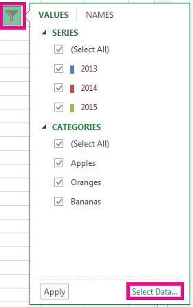
Step 5: Customize the legend
After selecting the “Legend” option, you can further customize it. Right-click on the legend to access various formatting options such as changing the font size, font style, or even removing the legend if necessary.
Tips for Creating Effective Legends
To create effective legends in Excel, consider the following tips:
- Keep it concise: Ensure that the legend provides clear and concise information without cluttering the chart.
- Use clear and descriptive labels: Use labels that accurately describe the data series or categories represented in the chart.
- Match the legend colors with the data series: Ensure that the colors or patterns used in the legend align with the colors or patterns in the chart.
- Position the legend appropriately: Place the legend in a location that doesn’t obstruct the chart or interfere with its interpretation.
The Bottom Line
In conclusion, adding a legend to your Excel charts is a fundamental step in improving the clarity and understanding of your data visualizations.
By following the comprehensive guide provided in this article, you now have the necessary knowledge and skills to confidently incorporate legends into your Excel charts.
Remember to keep your legends concise, use clear labels, match colors with data series, and position them appropriately for optimal impact. With a well-designed legend, you can effectively communicate the key information in your charts and enable viewers to interpret your data accurately.
So, go ahead and apply what you’ve learned, and take your Excel charts to the next level by adding informative and visually appealing legends.