Understanding the range and variety of chart types available in Excel is crucial for anyone looking to effectively visualize data. Excel offers a comprehensive suite of charting options that cater to diverse data sets and presentation needs.
Let’s look into the details of how many chart types does Excel offers and explore their significance and applications.
Exploring Excel’s Chart Types
Excel, widely used spreadsheet software developed by Microsoft, offers a robust selection of chart types to help users present their data in visually compelling ways.
The number of chart types available in Excel can vary slightly across different versions and updates, but generally, there are several core chart categories.
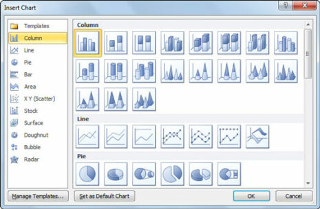
Here’s a breakdown of some common chart types you can find in Excel:
-
Column Charts
- Clustered Column
- Stacked Column
- 100% Stacked Column
- 3-D Clustered Column
- 3-D Stacked Column
- 3-D 100% Stacked Column
-
Bar Charts
- Clustered Bar
- Stacked Bar
- 100% Stacked Bar
- 3-D Clustered Bar
- 3-D Stacked Bar
- 3-D 100% Stacked Bar
-
Line Charts
- Line
- Stacked Line
- 100% Stacked Line
- Line with Markers
- Stacked Line with Markers
- 100% Stacked Line with Markers
-
Pie Charts
- Pie
- Exploded Pie
- 3-D Pie
- 3-D Exploded Pie
- Pie of Pie
- Bar of Pie
-
Area Charts
- Area
- Stacked Area
- 100% Stacked Area
- 3-D Area
- 3-D Stacked Area
- 3-D 100% Stacked Area
-
Scatter Charts
- Scatter
- Scatter with Smooth Lines and Markers
- Scatter with Smooth Lines
- Scatter with Straight Lines and Markers
- Scatter with Straight Lines
-
Other Specialized Charts
- Stock
- Surface
- Radar
- Bubble
- Doughnut
- Waterfall
- Histogram
- Box and Whisker
- Funnel
Significance of Excel’s Chart Types
The diverse range of chart types in Excel allows users to select the most suitable visualization method for their specific data and analytical goals. Choosing the right chart type is essential for effectively conveying insights and trends within data sets.
For instance:
- Column and Bar Charts: are ideal for comparing values across categories.
- Line Charts: are effective for displaying trends over time.
- Pie Charts: are useful for showing proportions or percentages.
- Area Charts: can highlight cumulative totals and trends.
- Scatter Charts: are excellent for visualizing relationships between variables.
- Specialized Charts: like Waterfall or Box and Whisker, can illustrate financial data or statistical distributions with clarity.
Step-by-Step Process to Access Chart Types in Excel
-
Select Data:
Highlight the data range you want to visualize.
-
Insert Chart:
Go to the Excel ribbon, click on “Insert,” and select the desired chart type from the Chart options (e.g., Column, Line, Pie, etc.).
-
Customize Chart:
After inserting a chart, use the Chart Tools to customize elements like titles, labels, colors, and data series.
-
Switch Chart Type:
Excel allows you to switch between chart types easily. Right-click on the chart, select “Change Chart Type,” and choose a different chart style if needed.

Conclusion:
Understanding how many chart types does excel offer empowers users to transform raw data into meaningful visuals that facilitate clearer understanding and decision-making.
By leveraging the right chart type for specific data scenarios, users can create impactful presentations, reports, and analyses. Understanding the available chart types and their applications is key to harnessing the full potential of Excel’s data visualization capabilities.