Color coordination in Excel is a valuable technique that enhances the readability and organization of data. When used effectively, it can make complex spreadsheets more intuitive and visually appealing.
In this detailed guide on how to color coordinate in excel, we’ll explore the significance of color coordination in Excel and provide a step-by-step process based on top Google results to help you master this skill.
Significance of Color Coordination in Excel
Color coordination in Excel serves several important purposes:
-
Enhanced Readability:
By assigning specific colors to different data categories, you can quickly identify trends, patterns, and outliers within your spreadsheet.
-
Visual Organization:
Color-coded cells make it easier to navigate through large datasets and distinguish between different types of information.
-
Highlighting Important Information:
Colors can be used to draw attention to critical data points or highlight specific values that require action.
-
Improved Presentation:
For reports or presentations, color coordination can transform complex data into visually appealing and easy-to-understand formats.
Step-by-Step Guide: How to Color Coordinate in Excel
Follow these steps to effectively color coordinate your Excel spreadsheets:
Step 1: Select Data to Color Coordinate
Identify the data range that you want to color code. This could be a column, row, or specific cells based on your requirements.
Step 2: Choose a Color Scheme
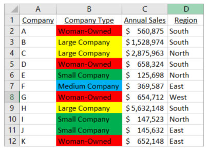
Decide on a color scheme that makes sense for your data. For instance, use green for positive values, red for negative values, and yellow for neutral or cautionary values.
Step 3: Apply Conditional Formatting
Conditional formatting is a powerful feature in Excel that allows you to automatically apply formatting based on specific conditions. Here’s how to use it:
-
Select the Data Range:
Click on the cells you want to format.
-
Navigate to Conditional Formatting:
Go to the Home tab, then click on “Conditional Formatting” in the Styles group.
-
Choose a Rule:
Select the type of rule you want to apply. For example, “Highlight Cells Rules” for numerical values.
-
Set the Conditions:
Define the conditions under which formatting should be applied. For instance, set rules such as “Greater Than,” “Less Than,” or “Between” certain values.
-
Choose Formatting Style:
Specify the formatting style you want to apply when the condition is met. This could be font color, cell color, or both.

Step 4: Apply Data Bars or Color Scales
Excel offers additional formatting options, such as data bars or color scales, which visually represent data values. Here’s how to use them:
-
Select Data Range:
Highlight the cells you want to format.
-
Navigate to Conditional Formatting:
Go to the Home tab, then click on “Conditional Formatting” and select either “Data Bars” or “Color Scales.”
-
Choose a Style:
Select the style that best suits your data visualization needs. Experiment with different options to find the most effective one.
Step 5: Customize Formatting (Optional)
Customize your color coordination further by adjusting font styles, cell borders, or adding icons to highlight specific data points.
Step 6: Review and Modify
Preview your color-coordinated spreadsheet and make any necessary adjustments to ensure clarity and consistency.
Tips for Effective Color Coordination
-
Keep it Simple:
Use a limited color palette to avoid visual clutter and ensure accessibility for all users.
-
Maintain Consistency:
Apply the same color scheme throughout the spreadsheet for uniformity and easy interpretation.
-
Consider Color Blindness:
Choose colors that are distinguishable for color-blind individuals by using tools like Color Brewer or checking for accessibility.
Conclusion:
By following these steps and tips on how to color coordinate in excel, you can effectively color coordinate your Excel spreadsheets to improve readability, organization, and overall data presentation.
Experiment with different techniques to find the style that best suits your data analysis needs and enhances your workflow. Color coordination is not just about aesthetics; it’s a powerful tool for data visualization and interpretation in Excel.