Excel, the powerhouse of spreadsheet applications, offers a multitude of features to empower users in data visualization. One crucial aspect of creating visually appealing and informative charts is labeling the X and Y axes effectively.
In this guide, we will explore various methods and hacks to know how to label X and Y axis in Excel to elevate your Excel charting skills, ensuring your data communicates its story effortlessly.
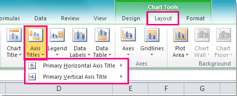
Method 1: Traditional Labeling
Let’s start with the basics. To label the X and Y axes traditionally:
- Select Your Data: Highlight the data you want to include in your chart.
- Insert a Chart: Navigate to the “Insert” tab and select the type of chart that best suits your data (bar chart, line chart, etc.).
- Access the Chart Elements: Click on the chart, and you’ll notice a “+” icon appearing. Clicking on it reveals various chart elements.
- Add Titles: To label the X and Y axes, select “Axis Titles.” A placeholder text box will appear, allowing you to input titles for both axes.
Method 2: Double-Click for Quick Edits
For a faster approach to labeling:
- Select the Axis Title: Double-click on the existing X or Y axis title to activate the text box.
- Enter Your Label: Type in the desired label directly without navigating through menus.
- Format as Needed: Right-click on the axis title to access formatting options. Customize font, size, color, and alignment to enhance visual appeal.
Method 3: Chart Tools for Precision
Excel’s Chart Tools provide additional control over axis labels:
- Select the Chart: Click on your chart to activate the “Chart Tools” contextual tab.
- Design Tab: Navigate to the “Design” tab within “Chart Tools” to find options for quick chart element edits.
- Add Chart Element: Choose “Add Chart Element” and select “Axis Titles” to include or modify X and Y axis labels.
Hacks for Creative Labeling:
Now, let’s explore some hacks to infuse creativity into your axis labels:
Hack 1: Rotated Axis Labels
- Select Axis Labels: Right-click on the axis labels (X or Y) and choose “Format Axis.”
- Rotation Options: Under the “Alignment” tab, you can adjust the angle of the axis labels. A slight rotation can enhance readability and add a touch of style.

Hack 2: Custom Axis Labels
- Data Labels: For a more personalized touch, use data labels instead of default axis labels.
- Label Options: Right-click on a data point, select “Add Data Labels,” and then format them to display the desired information.
Hack 3: Break the Axis Scale
- Scale Options: In certain scenarios, breaking the axis scale can provide a clearer representation of data. Right-click on the axis, choose “Format Axis,” and explore the scaling options.
- Adjust Breaks: Set custom breaks to emphasize specific data points, enhancing the overall chart’s visual impact.

Hack 4: Linked Axis Labels
- Dynamic Text Boxes: Instead of using default axis titles, create linked text boxes.
- Link to Cells: Type your desired label in a cell and link the text box to that cell. This way, your axis labels can dynamically update based on changes in the linked cell.
Conclusion
Mastering the art of labeling X and Y axes in Excel goes beyond the conventional. By exploring these methods and creative hacks, you can transform your charts into compelling visual narratives.
Whether you opt for traditional labeling or leverage innovative hacks, the key is to ensure your data communicates effectively, making an impact on your audience.
Excel’s versatility allows you to unleash your creativity and present data in a way that is not only informative but also visually captivating. So, dive into the world of Excel charting, armed with these techniques, and elevate your data visualization game.