Excel charts are a powerful tool for visualizing data, enabling you to make sense of complex information at a glance. However, creating and updating charts can be a daunting task for many users, especially when it comes to adding data. Fear not!
In this comprehensive guide, we will explore various methods to add data to a chart in Excel. Whether you’re a seasoned pro or a beginner, this article will equip you with the knowledge and skills you need to master the art of data input in Excel charts. Let’s dive right in.
Methods to Add Data to a Chart in Excel
1. Direct Data Entry:
-
- Select the chart by clicking on it.
- Click on the “Chart Elements” button (a plus sign icon) on the top-right corner of the chart.
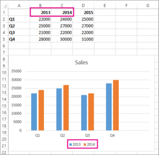
- Check the box for “Data Table.” This will add a table to your chart where you can directly input your data.
2. Using Excel Worksheet:
-
- Open your Excel worksheet and enter your data into columns or rows.
- Select the chart and right-click it.
- Choose “Select Data” from the context menu.
- Click the “Add” button under “Legend Entries (Series).”
- In the “Edit Series” dialog box, specify the data range for your chart.

3. Copying and Pasting Data:
-
- Copy the data you want to add to your chart from your worksheet.
- Select the chart and right-click it.
- Choose “Select Data” from the context menu.
- Click the “Add” button under “Legend Entries (Series).”
- In the “Edit Series” dialog box, paste your data into the “Series values” field.

4. Using Excel Tables:
-
- Convert your data range into an Excel table by selecting the data and pressing Ctrl+T.
- Create a chart by selecting the table data.
- As you update the table, the chart will automatically update with the new data.
5. Data Input from Another Worksheet or Workbook:
-
- Open both the worksheet with your chart and the one containing the data you want to add.
- Select the chart and right-click it.
- Choose “Select Data” from the context menu.
- Click the “Add” button under “Legend Entries (Series).”
- In the “Edit Series” dialog box, click in the “Series values” field and then navigate to the source data in the other worksheet or workbook.
6. Using Formulas:
-
- Create a new column in your worksheet for the data you want to add to the chart.
- Enter the necessary formula to calculate the values.
- Select the chart and right-click it.
- Choose “Select Data” from the context menu.
- In the “Edit Series” dialog box, specify the range of the newly created column with the formula.
7. Dynamic Charts with Defined Names:
-
- Define names for the data ranges you want to include in your chart. To do this, go to the “Formulas” tab and click “Define Name.”
- Select the chart, right-click it, and choose “Select Data.”
- In the “Edit Series” dialog box, enter the defined name as the series data range.
8. Data Entry Using Power Query:
-
- If your data is stored in an external source (e.g., a database), you can use Power Query to import and transform the data.
- After loading the data into Excel, create a chart using this newly imported data.
9. Linking to External Data Sources:
-
- If your data is regularly updated from an external source, you can link your chart directly to this source. This ensures that the chart always reflects the latest data.
- Go to the “Data” tab, select “Get Data,” and choose your preferred data source (e.g., SQL Server, SharePoint list).
- Configure the data source and create a chart that references this external data.
10. Data Input with Macros:
-
- For advanced users, you can use VBA (Visual Basic for Applications) to automate data input processes. Create a macro that updates your chart with new data from any source.
- Write a VBA script that fetches the data and updates the chart accordingly. Run the macro whenever you need to update your chart.
11. Real-time Data Feeds:
-
- If you require real-time data in your chart, you can use external plugins or add-ins (e.g., Power BI) to feed live data into your Excel chart.
- These solutions provide real-time data updates and advanced visualization options for dynamic charts.

Conclusion
Adding data to a chart in Excel is a crucial skill for data analysts, business professionals, and anyone who needs to communicate information effectively. This comprehensive guide has introduced you to various methods for adding data to your Excel charts, from simple direct entry to more advanced techniques like using macros and real-time data feeds.
Choose the method that best suits your needs and proficiency level. Whether you prefer a manual approach, automation, or real-time updates, Excel offers a range of tools to help you create and maintain accurate and insightful charts. With the knowledge gained from this article, you’re well-equipped to tackle any data visualization task in Excel with confidence.