Data visualization is a crucial skill for anyone working with large datasets today. Learning how to present information in a clear, compelling way allows us to convey complex ideas, identify insightful trends, and leave lasting impressions.
One simple yet powerful technique for enhancing data visualizations is switching the axis on Excel charts. Mastering this skill can take your Excel abilities to new heights. Read on as we explore the steps and benefits of effortlessly switching axis to unleash the full potential of your data.
Understanding the Basics
What is Switching Axis in Excel?
Switching Axis, in the context of Microsoft Excel, refers to the ability to change the orientation of data in your charts. Instead of the default horizontal data representation, you can switch it to vertical or vice versa. This seemingly simple feature can have a profound impact on the clarity and effectiveness of your data visualization.
Why Should You Care?
You might wonder why you should pay attention to something as seemingly trivial as switching the axis of your data. Well, the answer is simple – it can make your data more comprehensible and actionable. Here’s why you should care:
1. Improved Data Interpretation
Switching the axis can help you see trends and patterns in your data more clearly. When data is presented in a different orientation, it can reveal insights that may have been hidden in the default view.
2. Enhanced Visual Appeal
A well-designed chart or graph can significantly enhance your presentations and reports. Switching the axis allows you to create charts that are not only informative but also visually appealing.
3. Effective Comparison
In some cases, you may need to compare data points along different axes. Switching the axis makes it easier to compare values, facilitating better decision-making.
How to Switch Axis in Excel
Now that we understand the significance of switching the axis, let’s dive into how to do it in Excel. Follow these steps:
Step 1: Accessing the Chart Data
- Open your Excel spreadsheet containing the chart you want to work on.
- Identify the chart and select it by clicking on it.
- Right-click on either the horizontal (X-axis) or vertical (Y-axis) axis within the chart.
Step 2: Selecting Data
- After right-clicking, a context menu will appear. Choose the ‘Select Data’ option from the list.
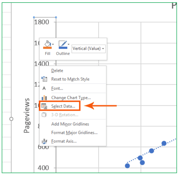
- A new window, ‘Select Data Source,’ will open, displaying your chart’s data series.
Step 3: Editing Data Series
- Inside the ‘Select Data Source’ window, click on the ‘Edit’ button.
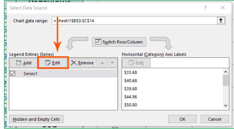
- Another window will appear, enabling you to customize your data series.
Step 4: Swapping Axis Values
- To switch the axis, locate the ‘Series X values’ and ‘Series Y values’ fields within the ‘Edit Series’ window.

- In the ‘Series X values’ field, replace the existing values with the ones you want to display on the Y-axis.
- Similarly, in the ‘Series Y values’ field, replace the values with those you want on the X-axis.

- Click ‘OK’ to confirm the changes.
By following these simple steps, you’ve successfully swapped the values on your chart’s axis.

Best Practices for Switching Axis
To make the most of this feature, here are some best practices to keep in mind:
- Consider Your Audience: Think about who will be viewing your chart. Ensure the orientation you choose makes sense to them.
- Label Clearly: Always label your axes clearly. This helps your audience understand what the chart represents.
- Experiment: Don’t be afraid to experiment with different axis orientations. You might discover new insights that were previously hidden.
- Keep it Simple: While switching the axis can be powerful, avoid making your charts too complex. Clarity should always be a priority.
No Data Modification Required
It’s crucial to note that during this process, you haven’t altered any values in your spreadsheet data. What you’ve done is customized the chart to present the information differently, making it more accessible and insightful.
Conclusion
In conclusion, mastering the art of axis switching in Excel is a valuable skill for anyone dealing with data visualization. It can elevate your presentations, enabling you to convey complex information with ease. With the ability to swap X and Y axis with just a few clicks, you can now create Excel charts that make data patterns pop.
Your audiences will be able to grasp concepts more easily, sparking engagement and interest. Don’t let clumsy workarounds hold your visuals back. Follow this guide on axis switching whenever you need to showcase your Excel data from a new perspective.
With practice, you’ll be able to customize dynamic charts that tell compelling stories. So tap into the true power of your data, and make an impact with high-quality visauals.