If you want to create visually appealing and informative line graphs in Excel, you’ve come to the right place. Line graphs are a fantastic way to represent data trends and make your reports or presentations more engaging. In this guide, we will walk you through the process of creating single and multiple-line graphs in Excel, offering step-by-step instructions and helpful tips along the way.
Types of Line Graph in Microsoft Excel
Excel offers various types of line graphs to suit different data presentation needs:
Line Chart: The classic 2-D line chart is ideal for representing data trends. Depending on your dataset, you can create a single-line chart or multiple-line chart.
Stacked Line Chart: This type is designed to show how parts of a whole change over time. Lines in this graph are cumulative, with each additional data series added to the first.
100% Stacked Line Chart: Similar to a stacked line chart, this version displays percentages rather than absolute values. The top line always represents a total of 100%.
Line with Markers: This version of the line graph includes markers at each data point, making it easier to spot trends.
3-D Line Chart: For a more visually engaging representation, you can use the 3-D line graph.
Creating Line Graphs in Excel
Setting Up Your Data for a Single-Line Graph
Before we dive into the specifics of creating line graphs, you’ll need to prepare your data properly. Follow these steps:
1. Organize Your Data: A line graph requires two axes: the time intervals (x-axis) and the dependent values (y-axis). Your dataset should have at least two columns, with time intervals in the leftmost column and the dependent values in the right column(s).
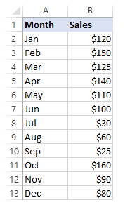
In the example below, we’ll create a single line graph using two columns of data:
2. Select the Data: In most cases, Excel can automatically detect your data when you select just one cell within the table. If you want to plot a specific portion of your data, make sure to include the column headers in your selection.
Inserting a Single Line Graph
With your source data ready, follow these steps to insert a single line graph:
1. Go to the Insert Tab: Locate the ‘Insert’ tab in the Excel ribbon.
2. Choose a Chart: In the ‘Charts’ group, click the ‘Insert Line or Area Chart’ icon. You’ll be presented with various chart types to choose from.
3. Select Your Chart: Hover your mouse over different chart templates to view a description and preview. Once you’ve made your selection, click on the template to insert it into your worksheet. In the example below, we are inserting a 2-D Line graph:
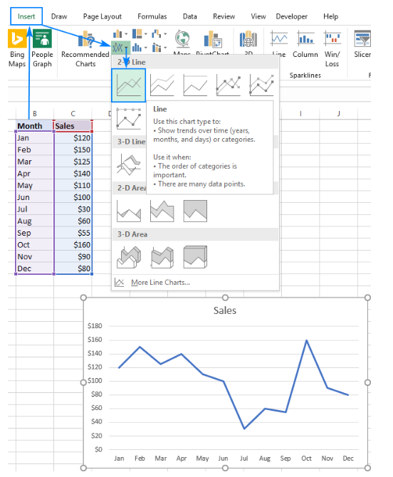
Your single-line graph is now ready, but don’t stop here if you want to add some customizations to make it even more stylish and attractive.
Creating Multiple Line Graphs
To create a multiple-line graph in Excel, follow the same steps as for a single-line graph. However, your data table should include at least three columns: time intervals in the left column and numeric observations in the right column. Each data series will be plotted individually.
1. Select Source Data: Highlight the data you want to include.
2. Insert Multiple Line Graph: Go to the Insert tab, click the ‘Insert Line or Area Chart’ icon, and select the 2-D Line or another graph type of your choice. In this case, we’ll choose a 2-D Line graph.

You’ll now have a multiple-line graph in your worksheet, allowing you to compare trends for different years or other data categories.

With these instructions, you’re well-equipped to create stunning line graphs in Excel for a variety of data analysis and reporting purposes.
Conclusion
In summary, line graphs are an invaluable tool for visualizing trends and insights from data in Excel. By leveraging the techniques explained in this guide, you can create elegant, informative line charts to enhance any data presentation. Whether you need to highlight time-series patterns or draw comparisons across categories, line graphs have you covered.
Put these tips into practice to become a line graph pro in Excel. Your data will shine as you create compelling visual narratives that grab attention and inspire action based on data-driven insights. Master line graphs to add an indispensable data visualization skill to your professional toolkit.