The Gantt chart, a vital tool for project management, takes its name from Henry Gantt, an American mechanical engineer and management consultant who pioneered this chart in the early 1910s.
This powerful visual representation, created using Microsoft Excel, organizes projects or tasks through cascading horizontal bar charts. It serves as a blueprint for project structures, highlighting start and finish dates, as well as relationships between project activities. A Gantt chart ensures that you can efficiently track your tasks against their planned timeframes and predefined milestones.
Crafting a Gantt Chart in Excel
Regrettably, Microsoft Excel doesn’t offer a built-in Gantt chart template. However, by harnessing Excel’s bar graph functionality and some formatting wizardry, you can swiftly create a Gantt chart. Follow these steps closely, and you’ll have a simple Gantt chart in under three minutes. We’ll use Excel 2010 for this example, but the process is consistent from Excel 2013 through Excel 365.
Step 1: Building a Project Table
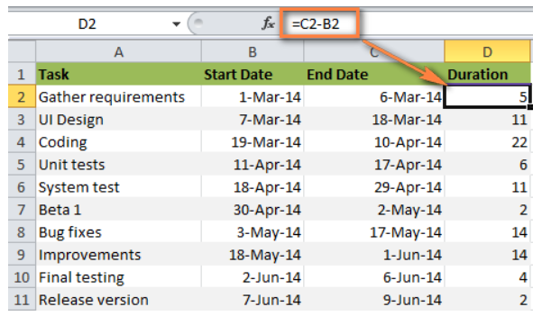
Initiate your Gantt chart project by inputting your project’s details into an Excel spreadsheet. Each task should occupy a distinct row, and structure your project plan to include the start date, end date, and duration (i.e., the number of days needed to complete the tasks).
*Tip: To create an Excel Gantt chart, only the Start date and Duration columns are essential. If you have both Start and End dates, you can calculate the Duration using one of these formulas, depending on your preference:
- Duration = End Date – Start Date
- Duration = End date – Start date + 1
Step 2: Crafting a Standard Excel Bar Chart Based on Start Date
To create your Gantt chart, commence by setting up a typical Stacked Bar chart:
- Select the range of your Start Dates, including the column header (e.g., B1:B11).
- Navigate to the Insert tab > Charts group and select Bar.
- Under the 2-D Bar section, choose Stacked Bar.
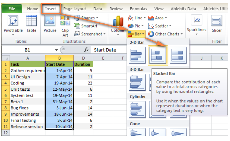
The result will be a stacked bar chart added to your Excel sheet.

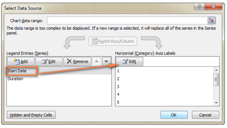
Step 3: Incorporating Duration Data into the Chart
To enhance your Excel Gantt chart, add another series to represent the task durations:
- Right-click within the chart area and select “Select Data.”

- In the “Select Data Source” window, the Start Date is already present under Legend Entries (Series). Add Duration to the list.

- In the “Edit Series” window, name this series “Duration” or a name of your choosing.

- Select your project’s Duration data, ensuring not to include the header or empty cells.

- Click OK to add Duration data to your Excel chart.

The resulting chart should resemble a Gantt chart with task durations clearly illustrated.

Step 4: Adding Task Descriptions
Replace the days on the left side of the chart with your list of tasks:
- Right-click within the chart plot area and select “Select Data.”
- Ensure Start Date is selected on the left pane and click the “Edit” button on the right pane, under Horizontal (Category) Axis Labels.
- A small Axis Label window opens; select your tasks in the same manner as you selected durations, ensuring the column header is excluded.
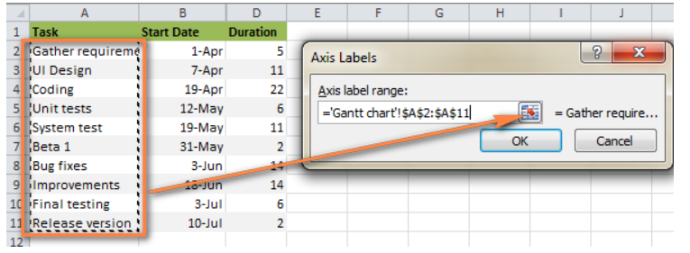
- Click OK twice to close the open windows.
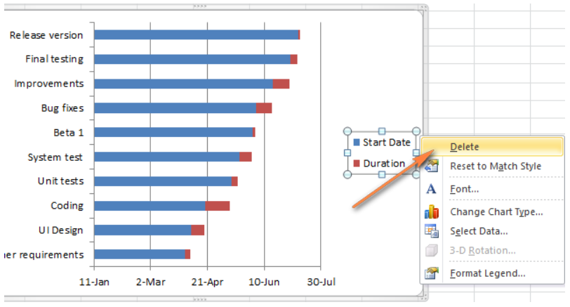
- Remove the chart labels block by right-clicking it and selecting Delete.
Your Gantt chart should now have task descriptions on the left side, providing a clear overview of your project’s structure.
Step 5: Transforming the Bar Graph into a Gantt Chart
At this stage, you have a stacked bar chart. To create a Gantt chart appearance, follow these steps:
- Click on any blue bar in your Gantt chart to select them all, right-click, and choose “Format Data Series.”
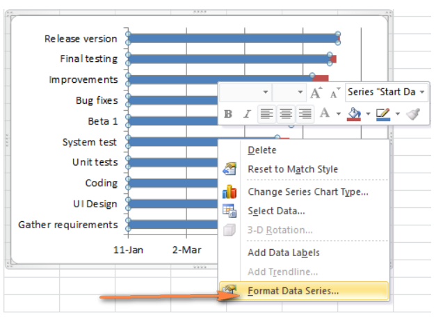
- In the “Format Data Series” window, select “No Fill” under the Fill tab and “No Line” under the Border Color tab.
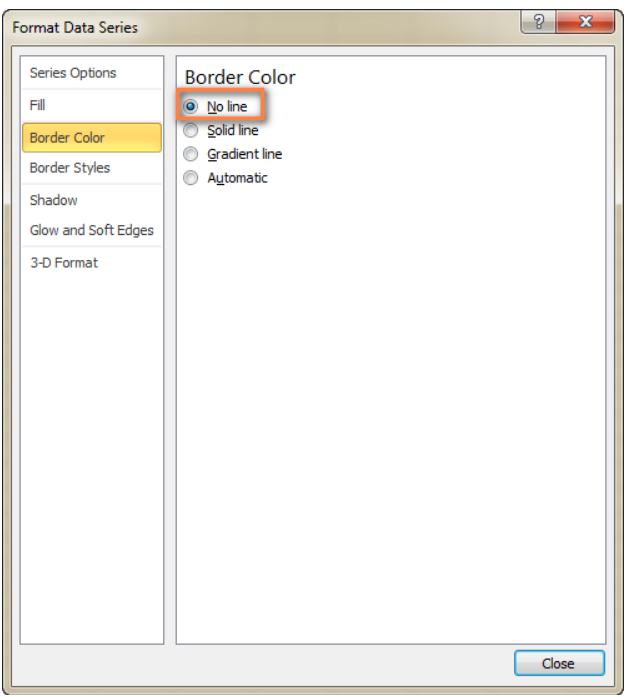
These adjustments make the blue bars transparent, leaving only the orange segments representing your tasks.
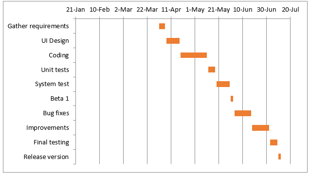
Additionally, you can adjust the order of tasks to align with your project’s requirements. This fine-tunes your Excel Gantt chart to mimic a traditional Gantt chart accurately.
Step 6: Enhancing Your Excel Gantt Chart Design
Your Excel Gantt chart is taking shape, but a few finishing touches can elevate its style:
Remove the empty space on the left side of the Gantt chart: Originally, the blue bars representing start dates occupied space at the beginning of your Gantt diagram. To bring your tasks closer to the left vertical axis, follow these steps:
- a. Right-click on the first Start Date in your data table, select “Format Cells” > “General,” and note the numeric representation of the date.
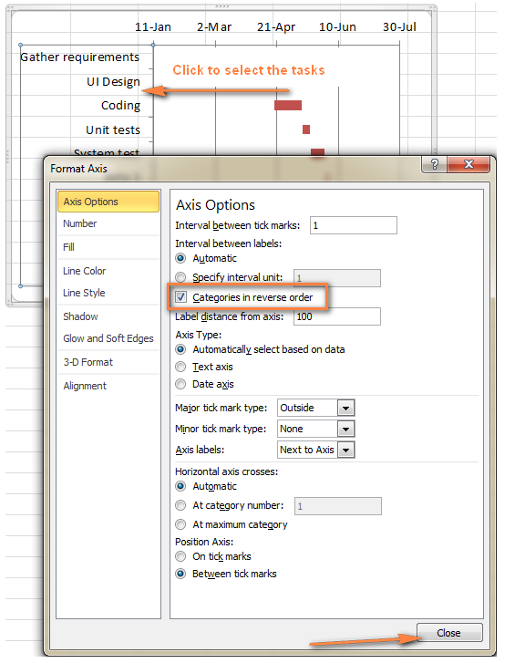
- b. Click on any date above the task bars in your Gantt chart, and under Axis Options, change “Minimum” to “Fixed,” entering the recorded number.
- c. In the same “Format Axis” window, set “Major unit” and “Minor unit” to “Fixed” and specify the desired date intervals.
Remove excess white space between the bars: To achieve a cleaner look for your Gantt chart, follow these steps:
- a. Click any of the orange bars to select them all, right-click, and select “Format Data Series.”
- b. In the “Format Data Series” dialog, set “Separated” to 100% and “Gap Width” to 0% (or close to 0%).
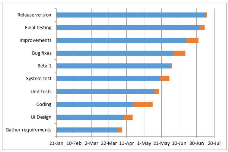
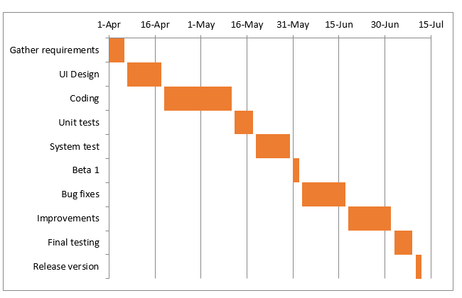
With these adjustments, your Excel Gantt chart transforms into a visually appealing project management tool.
The Bottom Line
In conclusion, While your Excel chart closely simulates a Gantt diagram, it retains the versatility of a standard Excel chart. You can effortlessly adapt it by adding or removing tasks, adjusting start dates or durations, and even saving it as an image or converting it to HTML for online publication. This step-by-step guide empowers you to create an efficient Gantt chart, a fundamental tool for effective project management.