Linear regression is one of the most vital statistical techniques for predictive analytics and forecasting. By establishing a relationship between dependent and independent variables, linear regression enables data-driven decision-making across industries including finance, healthcare, retail, and more.
However, the true power of linear regression lies in its practical applications using tools like Microsoft Excel. Equipped with Excel’s versatile features, professionals can conduct regression analysis to gain actionable insights from their business data.
This guide will explore step-by-step methods for performing linear regression in Excel, empowering you with the skills to make business forecasting a breeze. Follow these techniques, and you’ll be able to leverage predictive analytics to optimize decisions, actions, and strategies for success.
Method #1 – Creating a Scatter Chart with a Trendline
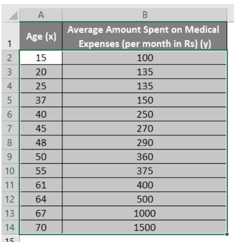
One of the fundamental techniques for linear regression in Excel involves creating a scatter chart with a trendline. Let’s illustrate this method with an example. Imagine you have a dataset containing information about individuals, including their age, body mass index (BMI), and medical expenses per month. You want to determine how age influences medical expenses. The linear regression equation for this scenario is:
Medical Expenses = b * Age + a
Here’s how you can do it step by step:
Step 1: Select Data Columns
Begin by selecting the two dataset columns (X and Y), including their headers.
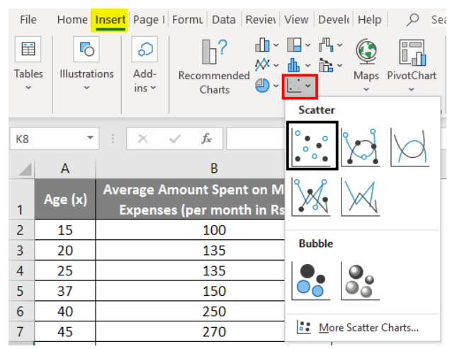
Step 2: Create a Scatter Chart
Navigate to the ‘Insert’ tab and expand the dropdown menu for ‘Scatter Chart.’ Select the ‘Scatter’ thumbnail (the first option) to generate a scatter plot.
Step 3: Add a Trendline
To add a regression line to your scatter plot, right-click on any data point and choose ‘Add Trendline.’

Step 4: Configure Trendline Options
In the ‘Format Trendline’ pane on the right, select ‘Linear Trendline’.

And ensure ‘Display Equation on Chart’ is checked.

Step 5: Customize Your Chart
Feel free to customize your chart according to your needs. You can add axis titles, change the scale, adjust colors, and alter the line type.

After refining your chart, it will resemble the one below:

Linear Regression in Excel Example
Note: In this type of regression graph, the dependent variable should always be on the y-axis, and the independent variable should be on the x-axis. If the graph is plotted in reverse order, swap the axes in the chart or switch the columns in the dataset.
Method #2 – Utilizing the Analysis ToolPak Add-In
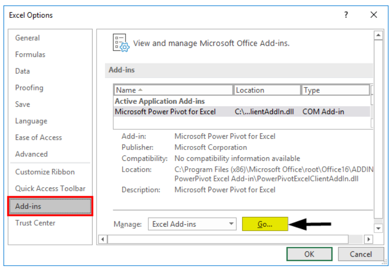
The Analysis ToolPak is a valuable Excel add-in for conducting linear regression. However, it may not be enabled by default. To activate it, follow these steps:
Step 1: Enable the Analysis ToolPak
- Click on the ‘File’ menu. Select ‘Options.’

- Proceed to the ‘Excel Options’ window

- Choose ‘Add-Ins’ from the left-hand menu.
- In the ‘Manage’ box, select ‘Excel Add-Ins’ and click ‘Go.’
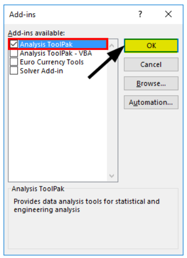
- Check the ‘Analysis ToolPak’ option and click ‘OK.’
Step 2: Run Regression Analysis
- Once the Analysis ToolPak is enabled, you can use it to perform regression analysis:
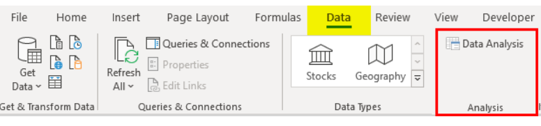
- Click on ‘Data Analysis’ in the ‘Data’ tab.
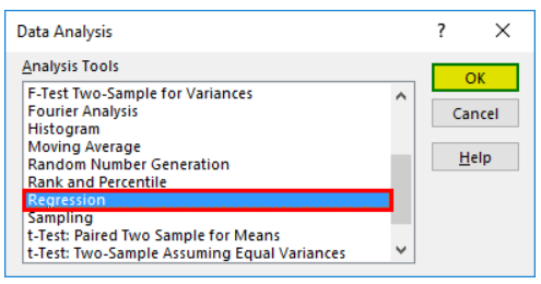
- Select ‘Regression’ and click ‘OK.’
- A regression dialog box will appear, allowing you to configure your analysis.
Step 3: Input Data and Settings
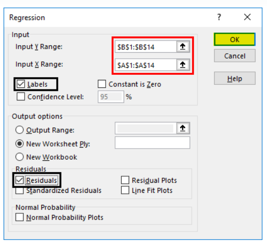
- Select the Input Y and X ranges (medical expenses and age, respectively). If you’re performing multiple linear regression, you can choose more columns of independent variables, such as BMI.
- Check the ‘Labels’ box to include headers. Choose the desired ‘output’ option.
- Select the ‘residuals’ checkbox and click ‘OK.’ The output of your regression analysis will be displayed in a new worksheet, providing information about Regression Statistics, ANOVA, residuals, and coefficients.
Step 4: Interpret the Output Regression
Statistics helps you understand the relationship between variables, with metrics such as Multiple R and R Square indicating the strength and goodness of fit. The ‘Significance F values’ can guide you in selecting predictors.
The coefficients section is crucial for constructing the regression equation, which allows you to predict values. For example, if you want to predict medical expenses when the age is 72, use the equation:
Medical Expenses = 16.891 * Age – 355.32 = 860.832
With this knowledge, you can predict medical expenses for various age values.
Residuals represent the difference between actual and predicted values, helping you assess the accuracy of your regression model.
The Alternative Method
The final method for conducting regression in Excel involves using statistical functions like SLOPE(), INTERCEPT(), CORREL(), and others. This approach is less common and generally used for specific requirements.
Conclusion
Mastering linear regression techniques in Excel unlocks game-changing predictive analytics capabilities for your business. Using these step-by-step methods, you can establish correlations, quantify relationships between variables, forecast future outcomes, and optimize data-driven decisions. Consistently apply these tips to conduct regression analysis like a pro. Your Excel skills will reach new heights, providing you with a competitive edge to lead your organization to continued success.