Dashboards are powerful data visualization tools that allow you to track key metrics and get actionable insights at a glance. Excel makes it easy to build interactive, dynamic dashboards using pivot tables and charts.
In this comprehensive guide, you’ll learn how to create a dashboard in Excel step-by-step to track and analyze data. With a few simple steps, you can build stunning Excel dashboards to visualize business performance like a pro.
Excel Dashboard | A Quick Overview
An Excel dashboard provides a one-page overview of your company’s key data points and performance indicators using tables, charts, gauges and other visuals. It allows you to monitor current status, identify issues and opportunities, and guide data-driven decisions.
Unlike static reports, a good dashboard is interactive and dynamic. It enables users to drill down into the data, filter by categories, and interactively change views for deeper insights.
With Excel’s powerful features like pivot tables, pivot charts, and slicers, you can create interactive dashboards to:
- Track daily, weekly or monthly KPIs
- Monitor department or product line performance
- Analyze customer segments and behavior
- Identify trends and outliers in sales or operations
- Guide executives and managers with timely insights
In this tutorial, you’ll learn step-by-step how to build a dashboard in Excel from scratch. Follow along to create your own data viz dashboard to extract powerful insights!
Make a Dashboard in Excel in 6 Easy Steps
Follow these 6 key steps to learn how to create a beautiful, interactive dashboard in Excel:
1. Get and Clean Your Data
An Excel dashboard is only as good as the data behind it. Start by importing your data source into Excel, whether it’s a company database, public data set, or results from a survey or experiment.
Make sure the data is structured with column headers and no blank rows/columns. Clean the data by removing errors, duplicates, etc. Using complete, clean data gives reliable outputs.
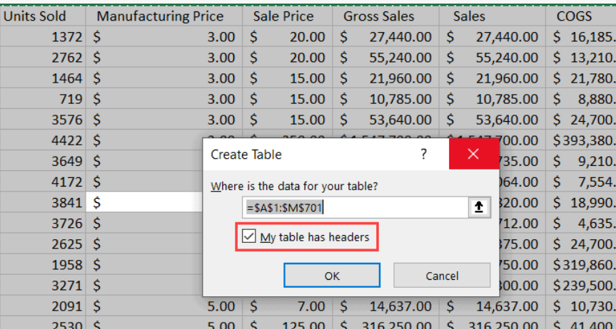
2. Structure the Data in a Table
Once cleaned, convert the data into an Excel table (Ctrl + T) rather than keeping it as a raw range.
This provides benefits like:
- Automatic column headers
- Easy sorting/filtering
- Dynamic updating when appending new data
- Structured referencing for formulas
3. Build the Pivot Table Foundation
Add a new worksheet and create your first pivot table based on your data table. Drag fields to the row, column and value areas to shape the pivot.
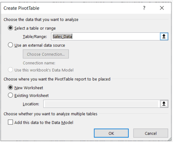
This summarizes your data and serves as the basis for the visualizations. Build additional pivot tables as needed for other views. Here is our sample pivot table for this blog post:

4. Create Pivot Charts
Insert a pivot chart linked to each pivot table to visualize the results graphically. Choose appropriate chart types based on the data.

Format the colors, labels, sizes, etc. to design them attractively. Each chart will become a key component of the dashboard.
5. Make a Dashboard Sheet
Add a new blank worksheet and call it something like ‘Dashboard’. One by one, copy your pivot charts from the previous sheets and paste them here.
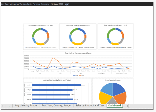
Arrange and size them appropriately to design your dashboard layout.
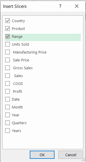
6. Add Interactivity with Slicers
Insert slicers connected to your pivot tables. This creates interactive filters allowing users to easily segment and sort data on the fly. Format slicers cleanly so they blend into your dashboard design. Adding slicers takes your static charts and makes the dashboard dynamic.
That covers the essential steps to create a functional Excel dashboard! Now let’s look at some advanced techniques:
- Add visual elements like sparklines, KPI symbols, dividers
- Include macros to enable auto-refresh or other logic
- Add drill-down buttons to view details
- Incorporate conditional formatting for visual cues
- Allow user input via dropdowns or text boxes
- Link charts and cells across sheets for integrated views
- Create a dynamic title based on selections
- Build a navigation sheet with a chart index
- Automate sheet printing or PDF exports
The possibilities are endless for creating polished, interactive Excel dashboards that bring your data to life!
Excel Dashboard Design Tips
Keep these tips in mind when building dashboards in Excel for best results:
- Simplify – Avoid clutter. Only vital info.
- Unify – Consistent layout and formatting.
- Spotlight – Draw attention to key data points.
- Summarize – Condense the big picture into a small space.
- Guide – Clearly direct next steps.
- Interact – Enable custom views.
- Refresh – Ensure the dashboard stays current.
- Automate – Use macros to enhance functionality.
- Document – Explain data sources and calculations.
- Modular – Allow adding/removing components.
- Share – Control access and permissions.
- Optimize – Use efficient formulas to avoid lags.
Conclusion
Learning how to create stunning dashboards in Excel is a valuable skill for data analysis. By transforming scattered data into clear, visual models, you can monitor workflow, track progress, identify issues, and guide smart decisions.
Using Excel’s built-in functionality for pivot tables, charts, and slicers along with design best practices, you can build centralized data hubs to track KPIs for your business, department, or specific project. The interactive dashboard examples and step-by-step tutorial covered in this guide will help you learn how to make a dashboard from your own data.
So try building a customized Excel dashboard today with your important datasets. Just follow the steps outlined to experience the power of visualizing your data! With the right data dashboards, you can significantly improve performance and results through data-driven management.