Microsoft Excel is a powerful tool for data analysis and visualization, but sometimes, you may encounter situations where you need to display two sets of data with different scales on the same chart. This is where the secondary axis comes into play.
Whether you’re a seasoned Excel user or just getting started, understanding how to add and customize a secondary axis can greatly enhance your ability to create informative and visually appealing charts.
In this blog post, we’ll walk you through the step-by-step process, providing you with the knowledge and skills you need to effectively use this feature in your Excel spreadsheets. So, let’s dive in and learn how to make your data presentation more insightful and dynamic!
Understanding the Secondary Axis
Before we delve into the intricacies of utilizing the Secondary Axis, let’s first understand its purpose. The Secondary Axis in Excel allows you to plot data series with different value scales on the same chart. This feature becomes invaluable when you have data that varies significantly in magnitude, making it challenging to present them coherently in a single chart.
The Importance of Visualizing Complex Data
Effective data visualization is crucial for conveying insights and trends hidden within complex datasets. With the Secondary Axis, you can visualize data relationships that might otherwise remain obscured, ensuring that your audience comprehends the nuances of your data.
How to Create a Secondary Axis in Excel – Step-by-Step Guide
Now that we have established the significance of the Secondary Axis, let’s dive into the practical aspects of creating one in Excel.
Method 1: Excel’s Recommended Charts Feature
If you are working with Excel 2013 or any higher version, such as Excel 2016, 2019, or Office 365, you’re in luck. Excel provides a convenient way to create charts with the Recommended Charts feature. Here’s how to use it to add a secondary axis:
Select Your Dataset: Begin by selecting the dataset you want to visualize.
Navigate to the Insert Tab: Click on the Insert tab located in the Excel Ribbon.
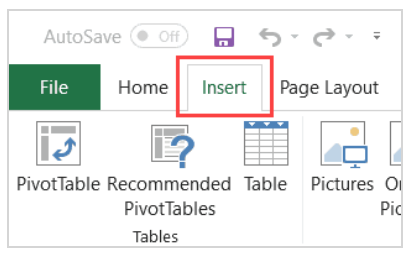
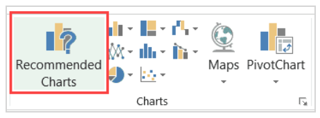
Access Recommended Charts: In the Charts group, find and click on the Recommended Charts option. This action will open the Insert Chart dialog box.
Choose the Right Chart: Examine the chart options displayed in the left pane. Select the one that already includes a secondary axis as part of the chart.
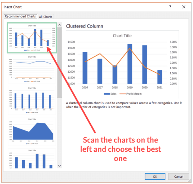
Finalize Your Selection: Click OK to generate the chart with a secondary axis.
It’s worth noting that Excel’s Recommended Charts feature is quite efficient in identifying time data, such as years or months, and incorporating them into the chart. However, if it doesn’t provide the exact chart you need, don’t worry; you can create it manually.
Method 2: Adding the Secondary Axis Manually (Excel 2013 and Above)
For cases where the Recommended Charts feature doesn’t meet your requirements, you can manually add a secondary axis with just a few clicks. Follow these steps:
Select Your Data Set: Start by selecting the dataset you want to visualize.
Visit the Insert Tab: Navigate to the Insert tab in the Excel Ribbon.
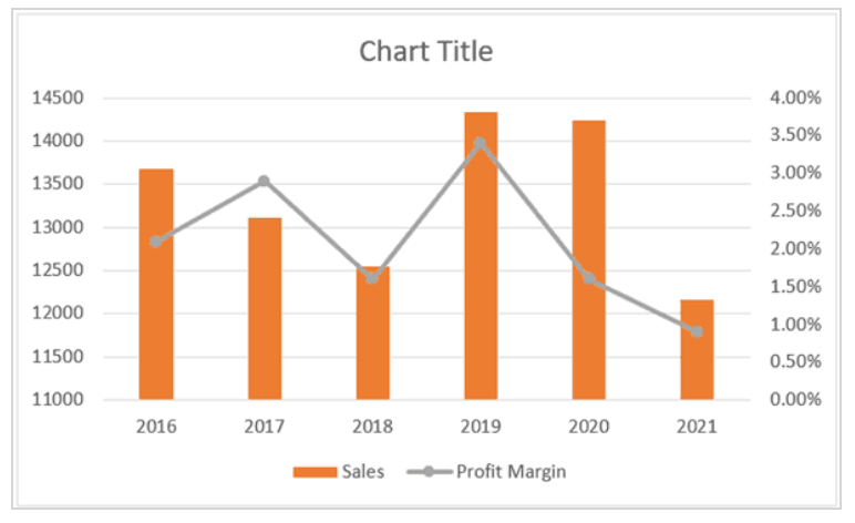
Choose Your Chart Type: In the Charts group, select the Insert Columns or Bar chart option.
Select a Clustered Column Chart: Click on the Insert Bar Column Chart option,

and then choose the Clustered Column chart type.

Highlight Profit Margin Bars: In the resulting chart, select the profit margin bars. If they are too small to select individually, choose any of the blue bars and press the tab key.

Format Data Series: Right-click on the selected Profit Margin bars and choose ‘Format Data Series.’

Enable Secondary Axis: In the right pane that appears, select the Secondary Axis option. This action will add a secondary axis, giving you two bars on the chart.

Change Chart Type: Right-click on the Profit Margin bar again, but this time select ‘Change Series Chart Type.’

Choose a Line Chart with Markers: In the Change Chart Type dialog box, change the Profit Margin chart type to ‘Line with Markers.’
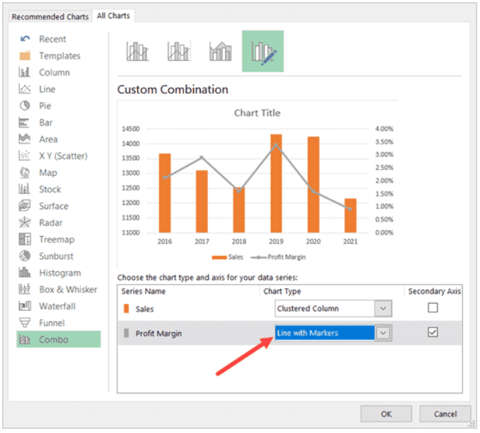
And there you have it! You’ve successfully added a secondary axis to your chart, with the data on the secondary axis represented as a line chart.
Customize Your Excel Charts for Clarity
Remember that the power of your Excel charts goes beyond just adding secondary axes. You can further enhance their clarity and professionalism by customizing them. For instance, you can format the line chart by right-clicking and selecting the ‘Format Data Series’ option. Simple adjustments, such as using contrasting colors for lines and columns, can make your Excel charts not only visually appealing but also easier to understand.
Best Practices for Secondary Axis Usage
To harness the full potential of the Secondary Axis, consider these best practices:
1. Label Clearly
Always label your axes and data series clearly. This ensures that your audience can easily interpret the chart, even with multiple axes.
2. Choose Appropriate Chart Types
Select chart types that best represent your data. For instance, use a line chart for time-series data and a bar chart for comparisons.
3. Maintain Consistency
Maintain consistency in data representation. Use the same scale and units on both the primary and secondary axes to avoid confusion.
4. Explain Your Data
Provide context and explanations for your chart. A brief caption or a legend can go a long way in helping your audience understand the significance of the data.
5. Practice and Experiment
Don’t be afraid to experiment with different chart types and formatting options. Excel offers a wide range of possibilities, so explore what works best for your specific dataset.
Real-world Applications
To illustrate the practicality of the Secondary Axis, let’s consider a real-world scenario. Imagine you’re analyzing sales data for a product that has both revenue and units sold. These two variables have vastly different scales. By using the Secondary Axis, you can create a chart that showcases the correlation between revenue and units sold over time, allowing you to identify trends and make informed business decisions.
Conclusion
In conclusion, mastering the Secondary Axis in Excel can significantly enhance your data visualization skills, enabling you to present complex information in a clear and understandable manner. By following the steps outlined in this comprehensive guide and adhering to best practices, you can create charts and graphs that convey valuable insights to your audience.