Excel, Microsoft’s powerful spreadsheet software, has been a staple tool for professionals and individuals alike, enabling users to manage and analyze data efficiently. Among its plethora of features, data bars stand out as an excellent visualization tool that helps users quickly grasp the significance of data points within a range.
Whether you’re a seasoned Excel user looking to enhance your data presentation skills or a beginner eager to explore the world of data visualization, this step-by-step guide will walk you through the process of adding data bars to your spreadsheets. We will cover everything you need to know about data bars, from understanding their purpose and benefits to customizing them to suit your specific data sets.
So, buckle up, as we embark on this Excel journey together, empowering you with the knowledge and skills to make your data speak volumes through visually appealing and informative data bars. Get ready to take your data presentation to new heights and transform those dull numbers into eye-catching, meaningful insights!
Understanding Data Bars
What are Data Bars?
Data bars are a data visualization feature in Microsoft Excel that allows you to represent the values in a selected range of cells using horizontal bars. These bars are added to the background of the cells and are proportionally sized based on the cell values.
Benefits of Using Data Bars
- Quick Visual Comparison: Data bars enable you to compare values at a glance, making it easier to identify trends and patterns in your data.
- Highlighting Extremes: By visualizing the distribution of data, data bars can help you quickly spot outliers and extreme values.
- Easy Data Analysis: Instead of analyzing raw numbers, data bars provide a more intuitive and visually appealing way to understand data.
How to Add Data Bars in Excel
Step 1: Open Microsoft Excel and Load Your Data
Begin by opening Microsoft Excel and loading the data you want to work with. Make sure the data is organized in a table format, with columns and rows clearly labeled.
Step 2: Select the Data Range
Next, select the range of data cells to which you want to apply data bars. This range will determine which cells will have data bars representing their values.
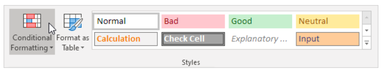
Step 3: Access the ‘Conditional Formatting’ Option
In the Excel ribbon, navigate to the ‘Home’ tab, then locate and click on the ‘Conditional Formatting’ button.
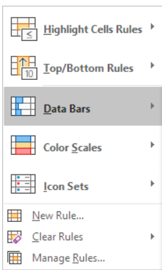
Step 4: Choose ‘Data Bars’ from the Menu
From the dropdown menu that appears after clicking on ‘Conditional Formatting,’ select the ‘Data Bars’ option.
Step 5: Select the Data Bar Type
Choose the type of data bars you want to apply. Excel offers various options, including solid bars, gradient bars, and more.

Step 6: Customize the Data Bars
After selecting the data bar type, you can further customize their appearance. Adjust the color, bar direction, and axis settings to suit your preferences.
Step 7: Confirm Your Settings
Review your data bar settings and ensure they accurately represent your data. Once satisfied, click ‘OK’ to apply the data bars.

Tips for Effective Data Bars
- Keep Data Bars Consistent: Maintain consistency in data bar colors and styles across your Excel sheet to avoid confusion and enhance clarity.
- Choose Suitable Colors: Select colors that are visually appealing and effectively convey the message you want to communicate through your data bars.
- Use Data Bars Sparingly: Avoid overcrowding your sheet with data bars. Use them judiciously to highlight critical information without overwhelming the viewer.
Common Mistakes to Avoid
- Overusing Data Bars: Using data bars excessively can clutter your sheet and diminish the impact of individual visualizations.
- Neglecting Data Labels: Always include data labels to provide context and ensure readers can understand the significance of the data bars.
- Misinterpreting Data Bar Lengths: Remember that the length of data bars represents the relative values of the cells they are applied to, not their absolute values.
Conclusion
Data bars have proven to be an invaluable tool for data visualization, allowing you to convey complex information at a glance and make your spreadsheets more engaging and informative. By following the instructions provided in this blog post, you have learned how to add data bars to your Excel worksheets effectively.
Furthermore, we delved into the purpose and benefits of using data bars, understanding their ability to highlight trends, patterns, and anomalies within your data. Whether you are a business analyst, a student, or anyone dealing with data, the knowledge gained here empowers you to present your information with clarity and impact. Now, go ahead and apply data bars to your own Excel data to enhance your data analysis experience!