Calibration curves are essential tools in scientific research and data analysis. They help establish a relationship between the concentration of a substance and the measured response, allowing for accurate quantification of unknown samples.
Excel, a popular spreadsheet program, offers a user-friendly platform to create calibration curves. In this article, we will guide you through the step-by-step process of making a calibration curve in Excel, enabling you to enhance the precision and reliability of your scientific measurements.
Understanding Calibration Curves
A calibration curve is a graphical representation of the relationship between the concentration of a substance and its corresponding measured response. It is constructed using a series of standard samples with known concentrations and their corresponding measurements. The calibration curve serves as a reference for determining the concentration of unknown samples based on their measured responses.
Importance of Calibration Curves in Data Analysis
Calibration curves are crucial in ensuring accurate and reliable data analysis. They enable scientists to account for any variations in the measurement system, such as instrument drift or experimental conditions. By establishing a calibration curve, researchers can confidently quantify unknown samples, minimizing errors and ensuring the validity of their findings.
Making a Calibration Curve in Excel – A Step-by-Step Guide
Gathering Data for Calibration Curve
Selection of Standards
To create a calibration curve, you need a set of standard samples with known concentrations. The standards should cover a range of concentrations that are relevant to your analysis. Ideally, it is best to include a blank sample (containing no analyte) and a sample with a concentration near the expected range of your unknown samples.
Measuring the Response
Measure the response of each standard sample using an appropriate analytical technique. The response can be in the form of absorbance, fluorescence intensity, or any other measurable quantity that correlates with the concentration of the substance you are analyzing.
Preparing the Excel Spreadsheet
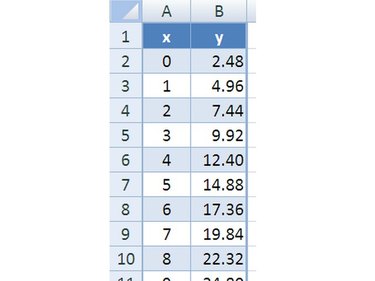
Setting up Columns and Rows
Open a new Excel spreadsheet and arrange your data in columns. The concentration values should be listed in one column, and the corresponding response values in another column. Ensure that each data point is correctly assigned to its respective row.
Labeling Data
Label the columns with appropriate headers to clearly identify the concentration and response values. This labeling will help you easily reference the data when creating the calibration curve.
Plotting the Calibration Curve
Selecting Data Points
Select the data points representing the concentrations and their corresponding responses. To do this, click and drag your cursor over the cells containing the data.
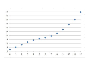
Creating a Scatter Plot
With the data points selected, navigate to the “Insert” tab in Excel’s toolbar. Click on “Scatter” and choose the scatter plot type that best suits your data. Excel will generate a scatter plot with your selected data points.
Adding Trendline and Equation
Choosing the Appropriate Trendline
Right-click on any data point on the scatter plot and select “Add Trendline” from the context menu. In the “Format Trendline” dialog box, choose the appropriate trendline type that represents the relationship between concentration and response accurately. Linear trendlines are commonly used for calibration curves.
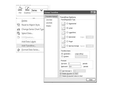
Displaying the Equation on the Chart
To display the equation of the trendline on the chart, check the “Display Equation on chart” box in the “Format Trendline” dialog box. The equation will appear on the chart, providing you with a mathematical representation of the calibration curve.
Evaluating the Calibration Curve
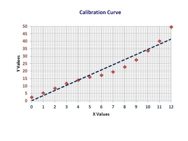
Assessing Linearity and R-squared Value
Linearity is an essential characteristic of a calibration curve. To assess linearity, examine the distribution of data points around the trendline. The closer the data points align with the trendline, the better the linearity. Additionally, Excel provides an R-squared value that quantifies the goodness of fit of the trendline. An R-squared value close to 1 indicates a high level of linearity.
Analyzing Residuals
Residuals are the differences between the measured responses and the responses predicted by the calibration curve. Analyzing the residuals helps identify systematic errors or outliers that may affect the accuracy of your quantification. Plotting the residuals against the concentration values can provide valuable insights into the quality of your calibration curve.
Using the Calibration Curve for Quantification
Interpolating Unknown Sample Concentrations
Once you have a reliable calibration curve, you can use it to determine the concentration of unknown samples. Measure the response of the unknown sample using the same technique employed for the standards. Locate the corresponding response value on the calibration curve and read the corresponding concentration value.
Calculating the Uncertainty
When quantifying unknown samples, it is crucial to account for the uncertainty associated with the calibration curve. Consider factors such as the precision of the measurements and the variability of the standards. Properly calculating and reporting the uncertainty will enhance the reliability and credibility of your results.
Enhancing the Calibration Curve
Increasing the Number of Standards
To improve the accuracy and robustness of your calibration curve, consider increasing the number of standard samples. A larger number of standards will provide a more comprehensive representation of the concentration range and allow for a better fit of the trendline.
Optimizing Measurement Techniques
Evaluate and optimize the measurement technique used to obtain the response values. Factors such as instrument settings, sample preparation methods, and data acquisition parameters can influence the quality of the calibration curve. By refining these aspects, you can improve the precision and accuracy of your measurements, leading to a more reliable calibration curve.
Troubleshooting Common Issues
Outliers and Erroneous Data Points
Sometimes, you may encounter outliers or erroneous data points that deviate significantly from the expected trend. It is crucial to identify and address such issues to maintain the integrity of your calibration curve. Consider verifying the accuracy of the measurements, rechecking data entry, or conducting additional experiments if necessary.
Nonlinear Calibration Curves
In certain cases, the relationship between concentration and response may not be linear. Excel provides options to fit polynomial, exponential, and logarithmic trendlines to accommodate nonlinear calibration curves. Experiment with different trendline types and assess their suitability for your data.
Conclusion
Creating a calibration curve in Excel is a valuable skill for scientists and researchers involved in data analysis. By following the step-by-step process outlined in this article, you can generate accurate and reliable calibration curves to quantify unknown samples.
Remember to select appropriate standards, plot the calibration curve, evaluate its linearity, and utilize the curve for quantification while considering the associated uncertainties. With practice and attention to detail, Excel can be a powerful tool in your scientific endeavors.